Information for Action
Seeing
Chapter 6 · Visualisation
The eyes of the RHIS: from a wall of numbers to a picture that prompts action.
From Picture to Story, a five-minute film in a South African voice with captions. Watch it on the films page →
By the time you have read this chapter, you will be able to:
- Apply the "less is more" principle by selecting five action indicators to present from your annual operational plan and justify why each belongs on your main dashboard.
- Choose the appropriate graph type (line, bar, pie, cumulative coverage) for different messages, apply the six golden rules to create clear visuals, and follow the eight-step process to turn a graph into a narrative that prompts action.
- Interpret a GIS map to identify spatial patterns. These may relate to equity, emergency response, or environmental risk, and propose one specific local action based on what the map reveals.
- Use scorecards, league tables, heatmaps, and pivot tables responsibly, recognising both their value for comparison and their risks for demoralisation or data manipulation.
- Critique a PHC dashboard using the core principles of good dashboard design, and adapt it for three different settings: a wall chart, a mobile screen, and a projected display.
Introduction: The forest before the trees
Imagine a room full of numbers. Columns and rows of boring figures, stretching across piles of dusty pages stacked on sagging shelves. Now imagine that same data transformed into a simple line climbing upwards, a map with a cluster of bright red dots, or a dashboard that shows at a single glance which clinics are thriving and which are struggling.
This is the power of visualisation. It is the moment when data becomes visible, understandable, and most importantly, actionable. If data is the raw material of your health information system, then visualisation is its eyes. It is what allows you, the health manager, to see the patterns, spot the outliers, and grasp the story that the numbers are trying to tell.
But before we dive into the tools, we need to step back and see the forest. Visualisation is not an end in itself. It is a means to answer specific questions. And the questions depend on who you are.
What questions are we trying to answer?
At every level of the health system, managers ask the same core questions, but they ask them differently. Visualisation is the tool that answers them.
| The Question | Visualisation Tool | Level |
|---|---|---|
| What happened? | Line graph, bar chart, run chart | All levels |
| Where did it happen? | Map (hand-drawn or GIS) | Facility, District |
| How are we doing against targets? | Cumulative coverage graph, target lines | All levels |
| Who is performing well/ poorly? | Scorecard, league table | District |
| Where are the patterns/ hotspots? | Heatmap, GIS map | District |
| What is the overall picture? | Dashboard (glance then dive) | District |
| What might happen next? | AI predictive analytics | National / Provincial |
Who needs what?
Not every manager needs to master every tool. The skills required at a rural clinic are different from those needed at the district headquarters. But everyone needs to understand the power of visualisation and how to use it to drive action.
| Level | Essential Visualisation Skills | Nice to Have (with support) |
|---|---|---|
| Community / Facility | Hand-drawn line graphs, bar charts, cumulative coverage graphs, target lines, simple maps | Computer-generated graphs, digital dashboards |
| District | All of the above + scorecards, league tables, heatmaps, GIS maps (basic interpretation), dashboard design | Advanced GIS, pivot tables, AI tools |
| National / Provincial | All of the above + advanced GIS, predictive analytics, AI | N/A |
A roadmap through this chapter
This chapter is organised as a journey. We start with the essential tools that every manager must master, the foundation of visualisation. These are the tools you can use with a pen and paper, a whiteboard, or a simple spreadsheet. They are the bread and butter of data use at the facility and district level.
Then we move to the advanced tools that district managers and above use to solve complex problems, GIS maps, scorecards, league tables, and heatmaps. These require computers and some training, but they unlock deeper insights.
Next, we look at the command centre, the dashboard, which pulls everything together into a single, integrated view.
Finally, we peer into the near future, to the incredible potential of Artificial Intelligence to not just show us what has happened, but to predict what is coming and guide us towards the most effective actions.
Whether you are drawing with a pen on a flip chart or developing a dynamic digital dashboard, the goal is the same: to see clearly, to understand as deeply as you need, and to act decisively according to your level. Let's open the eyes of your RHIS.
6.1 The essential tools: What every manager must master
This section covers the foundational skills of visualisation. They are simple, powerful, and can be done with a pen and paper. Every facility manager and district officer should master these tools before moving on to more advanced techniques.
6.1.1 Why visualise? From numbers to insight
Raw data is like a pile of unassembled bricks. It has potential, but it is not yet a wall, let alone a building. Visualisation is the act of assembling those bricks into a structure you can see, walk through, and understand.
Why is visualisation so important for health management?
We are visual creatures. Our brains are wired for pictures: a graph is processed by the brain 60,000 times faster than a table of numbers. A well-designed chart can reveal in seconds a trend that would take minutes or hours to find in a spreadsheet.
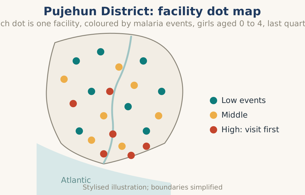
It uncovers what is hidden. Visualisation makes the invisible visible. A map can reveal a cluster of malaria cases that was hidden in the aggregated district average. A time-series graph can show the impact of a new intervention that a simple monthly total would miss.
It speaks a universal language. A line graph going up means "more." A bar chart showing one clinic far below others means "problem." Visuals transcend language and technical expertise, allowing everyone from cleaner to district manager to community leader to understand and engage with the data.
It demands a question. A good graph does not only provide answers; it provokes curiosity and more epidemiological questions. Why did that line dip in March? Why is that bar so much higher than the others? This question is the beginning of curiosity, leading to analysis, understanding, discussion and, ultimately, action.
6.1.2 Less is more: The discipline of selection
Before any map or dashboard can be used, a discipline must be exercised: selecting no more than five (maximum ten) action indicators to visualise at a time. This is difficult because the temptation is to try to show everything. But a PHC facility manager drowning in fifty metrics sees nothing clearly, and the self-assessment team needs to focus on the most important issues currently affecting service delivery.
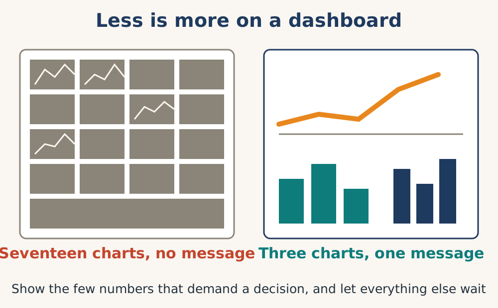
The rule is simple: every indicator on the main dashboard must be drawn directly from the facility's annual operational plan. If it is not in the plan, it does not belong on the front page.
For example, a rural clinic might show only: 1) Measles 1st dose (0-11 months) coverage, 2) Diarrhoea treated with ORS+Zinc rate (0-4 years), 3) Antenatal 4th visit care rate, 4) Child measured for age & height rate, 5) Malaria test positivity rate, and 6) Stockout days for tracer medicines. These five or six tell a complete story of that facility's priorities. Everything else lives one click deeper, available for exploration but not cluttering the manager's immediate attention.
This constraint forces strategic thinking: what truly matters this quarter? What can the team do something about now?
6.1.3 Making graphs that work: The golden rules
A graph can be beautiful but useless. To ensure your visuals are effective tools for decision-making, follow these golden rules.
Trust the Data First: A visual is only as good as the data behind it. Always, always verify data quality before you visualise.
Know Your Audience: A graph for a community health worker should be different from a graph for a national policymaker. The community worker needs actionable, local detail. The policymaker needs the big-picture trend.
Choose the Right Graph: Do not use a pie chart for 20 categories. Do not use a line graph for categorical data. Match the graph to the message.
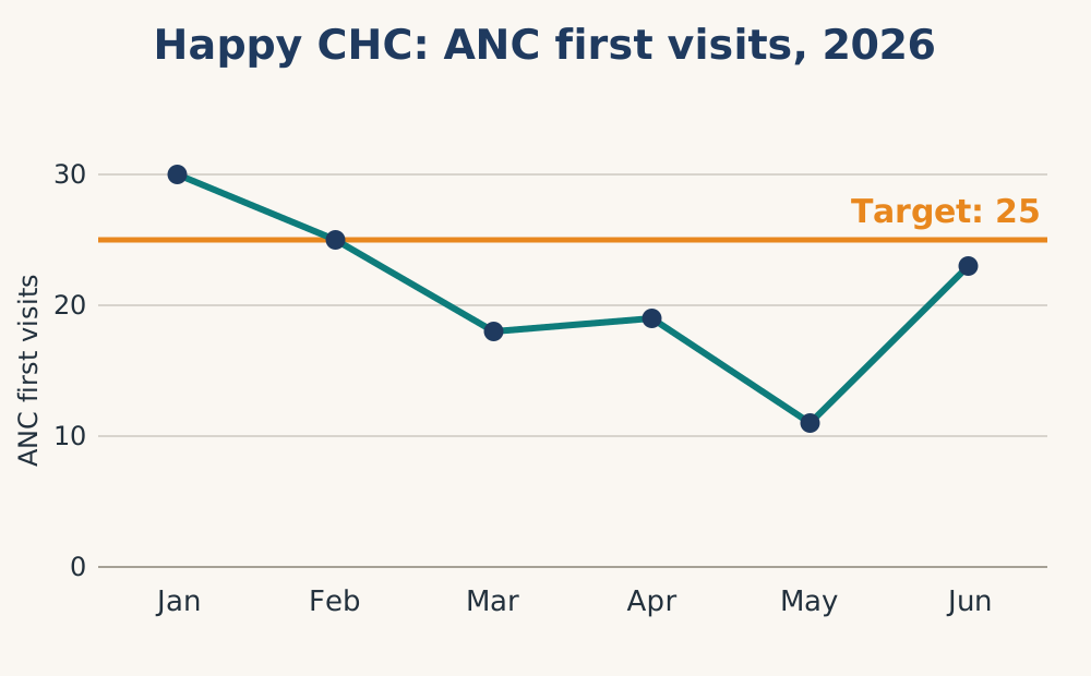
Trend over time? Use a line graph.
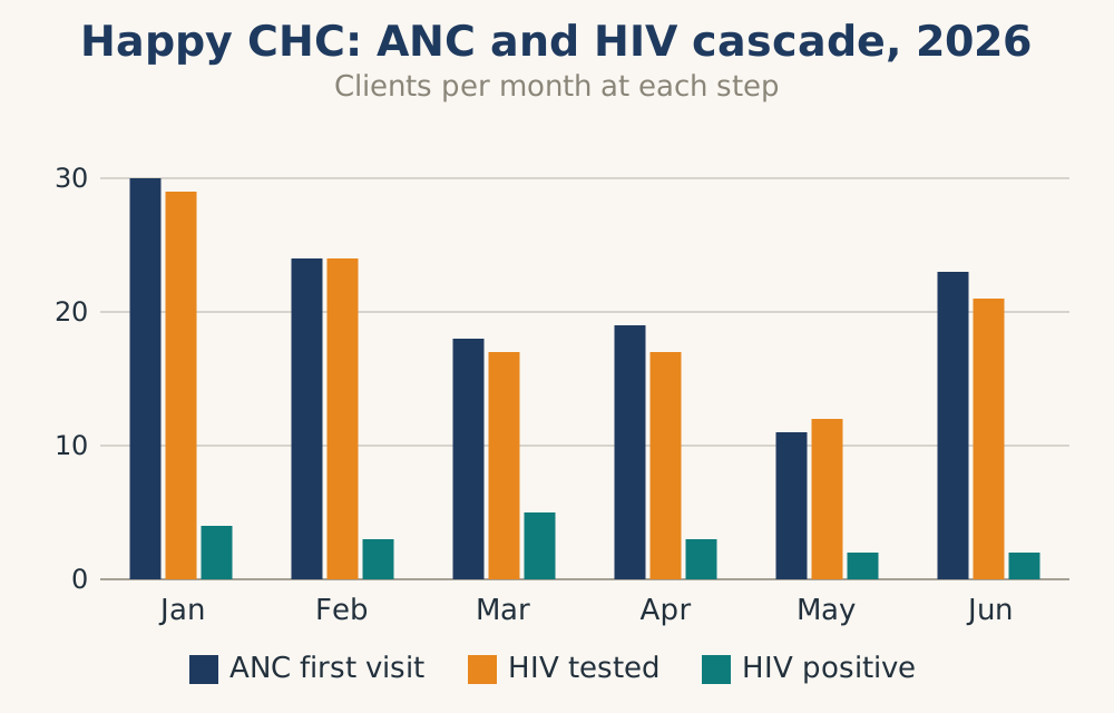
Comparison between groups? Use a bar chart.
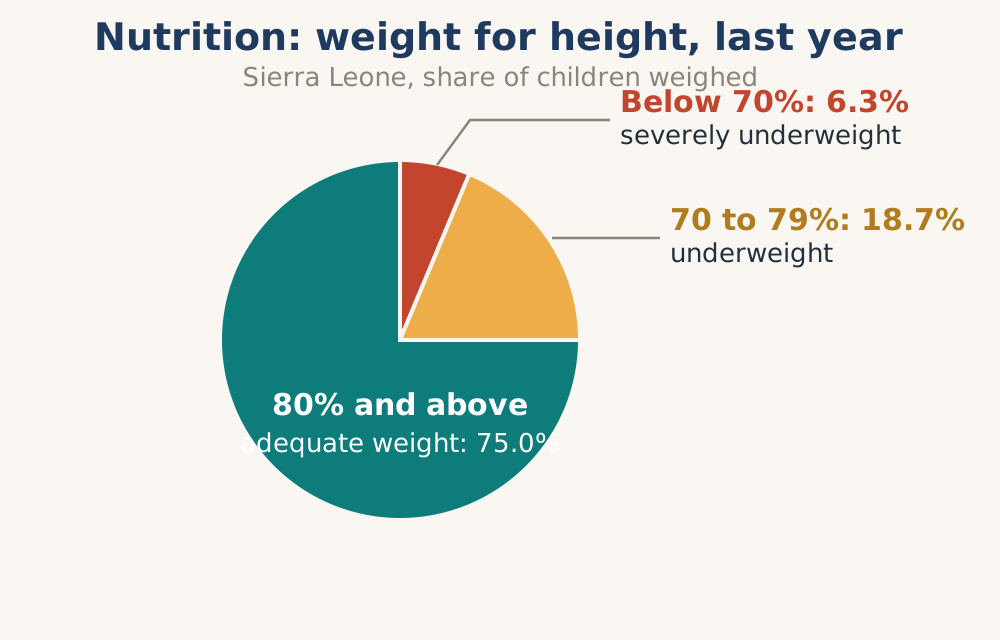
Part of a whole? Use a pie chart (but only for a few, simple categories).
Geographic distribution? Use a map.
Keep it Simple and Clear: A cluttered graph is a confusing graph. Remove unnecessary gridlines, backgrounds, and fancy effects. Use a clear title, label your axes, and include a simple legend. Your goal is clarity, not artistic expression.
Highlight the Key Insight: Do not make the viewer hunt for the message. Use colour, an annotation, or a label to point directly to the most important point. "This is where we exceeded our target." "This is the problem we need to solve."
Always Look for the Story: A graph without a story is just a picture. Ask yourself: What surprised me? What question does this graph answer? What action does it suggest? What new question does it raise?
6.1.4 Two great traditions: Hand-drawn and computerised graphs
In the world of health data visualisation, we are blessed with two powerful traditions. They are not rivals; they are partners. The key is to know the strengths of each and use them together.
The enduring power of the hand-drawn graph
Before computers, health managers drew their graphs by hand. They were simple, often scrawled on a flip chart or a faded piece of paper pinned to a wall. But they were, and still are, incredibly powerful.
Example of a hand drawn graph
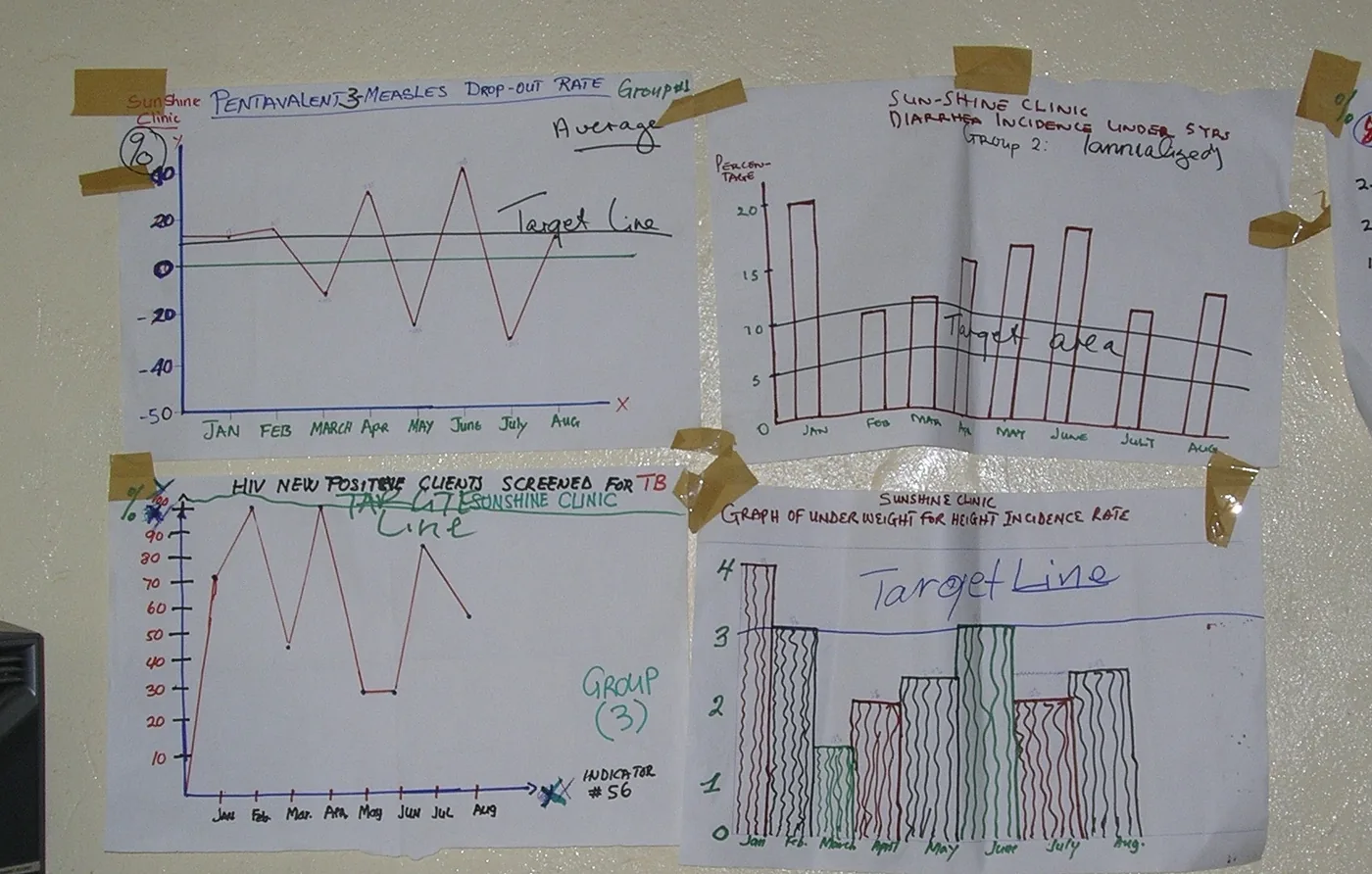
Why the hand-drawn graph still matters:
It is Immediate and Democratic: Anyone can draw a line or a bar chart. You do not need a computer, software, or even electricity. You can create it together as a team, at the moment, under a tree.
It is a Constant Presence: A graph on the wall is a daily reminder of your goals. It is seen by every staff member, every patient, every visitor. It becomes part of the fabric of the facility.
It Builds Ownership: When you draw a graph yourself, you own it. You understand the numbers because you put them there yourself. It is a tangible representation of your team's work.
It is a Tool for Team Discussion: A hand-drawn graph on a flip chart is a natural focal point for a team meeting. You can point, annotate, argue, and celebrate together, right there.
Simple graphs can be drawn by hand, though they are increasingly drawn on computers as the digital age puts powerful visualisation tools down to facility level and even into the hands of community leaders with smartphones
| Simple graphs | ||
|---|---|---|
| Type | Use | Advantages |
| Line Graph | Showing a trend over time (e.g., monthly patient visits) | Simple to draw. Perfect for showing improvement or decline at a glance. |
| Bar Chart | Comparing different categories (e.g., different clinics, diseases). . | Easy to make comparisons. Visually impactful |
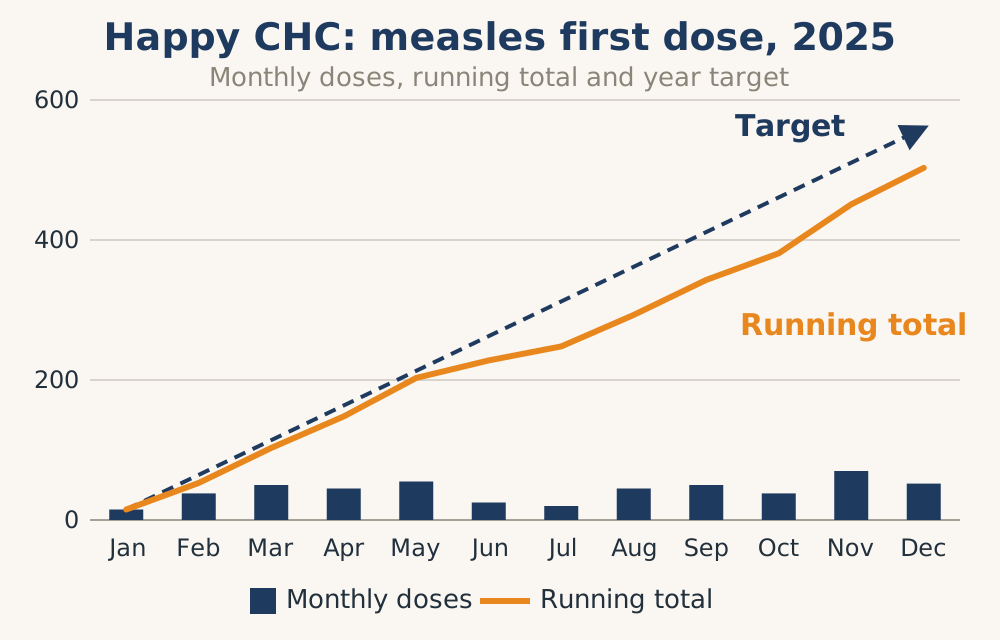
| Cumulative Cover age Graph | Shows coverage: Tracking progress towards a target (e.g., immunisation coverage). | Shows both monthly progress and total achievement. Essential wall chart. A powerful motivator |
| Pie Chart | Showing the proportion of a whole (e.g., age breakdown, different diseases seen). . | Gives an instant sense of the biggest issues |
Target Lines are the key to taking action. All indicators should be developed with a target in mind.
Coverage indicators measure what percentage of the target population has been reached.
Drop out rates should have a target to see that more children are being reached to complete the immunisation schedule.
Service treatment care should be monitored to ensure that patients are being given quality care. A good example is children with diarrhoea being given ORS and Zinc.
Target lines ensure that staff know what is expected.
A Call to Action: Do not let your digital tools completely replace this tradition. Every clinic should have a "data wall" where a few key, hand-drawn graphs are displayed and updated monthly. It is a powerful statement that data is everyone's business.
The power of computerised graphs
When you need to go beyond the basics, the computer is your ally. Modern software can create sophisticated, beautiful, and interactive visuals that unlock deeper insights.
This section (and the section on GIS) is for district level and higher where both computers and personnel trained to use the various features are in place. This more sophisticated analysis supports the use of data for action in the periphery and is important for problem solving and action.
Advanced Computerised Graphs:
These graphs are made at district level and above, and the details of how to make them are not dealt with here. Local managers need to understand only their incredible power to solve complex problems.
Run chart sophistications
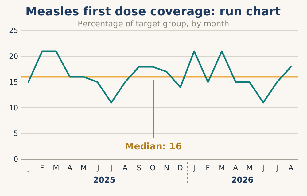
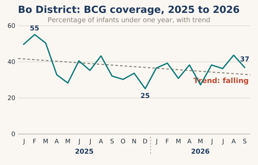
Time-Series with Trend Lines: A computer can add a moving average or a trend line to your data, smoothing out the noise to reveal the true underlying pattern.
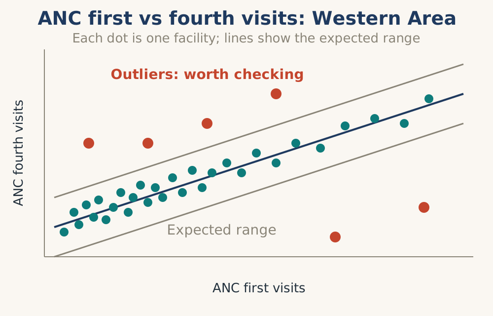
Heatmaps: Use colour gradients to show intensity. A heatmap of malaria incidence can instantly show you which Chiefdoms are hotspots.
Heatmap example
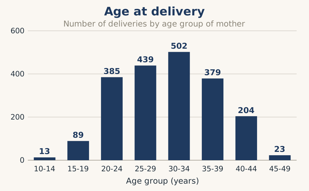
Histograms: Show the distribution of a dataset. You can use it to see, for example, the age distribution of the women who deliver in the facility.
Infographics: Combine text, icons, and graphs into a visually appealing, shareable story. Perfect for communicating with the public or advocating to funders.
6.2 Advanced tools: District level and above
This section covers the tools that require computers, specialised software, and some training. They are essential for district managers and above to solve more complex problems, identify patterns, and make comparisons across facilities.
Programme and facility managers do not necessarily need to know how to create these, but they need to understand what they are and how to interpret them.
6.2.1 GIS: A new visual dimension to analysis
Modern GIS is mainly computer-based, and the skills and computers to make them are usually at district level and above. However, as shown by John Snow, hand-drawn maps can change science and be very useful to local managers. They need not be 100% accurate, but they give a visual feel for the catchment area. For instructions on how to make hand-drawn maps, see the Equity Project Hand-drawn Maps Booklet.
The story of John Snow
Long before computers, dashboards, or even the germ theory of disease, a London physician named John Snow did something quietly revolutionary. In 1854, as cholera ravaged the Soho district of London, Snow didn't just count the dead. He walked the streets, collected addresses, and drew a map. On that simple paper plot, each black bar marked a cholera death. When he looked at the finished map, a pattern leaped out: the deaths clustered tightly around a single water pump on Broad Street.
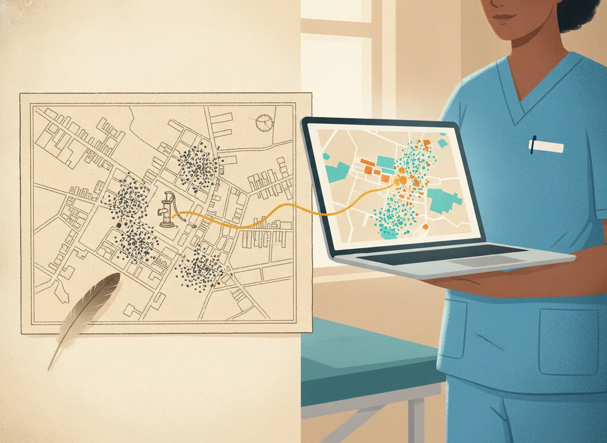
That visual story was so compelling that authorities removed the pump handle, the outbreak collapsed, and medical history was changed forever. Snow never saw the cholera bacterium; he saw its geography, and that was enough.
Modern GIS
Today, we can do far more than draw black bars on a street map. Modern Geographic Information Systems (GIS) add a breathtaking new dimension to data analysis, though these skills are often at district level. Where Snow had static dots, we have layered, living maps.
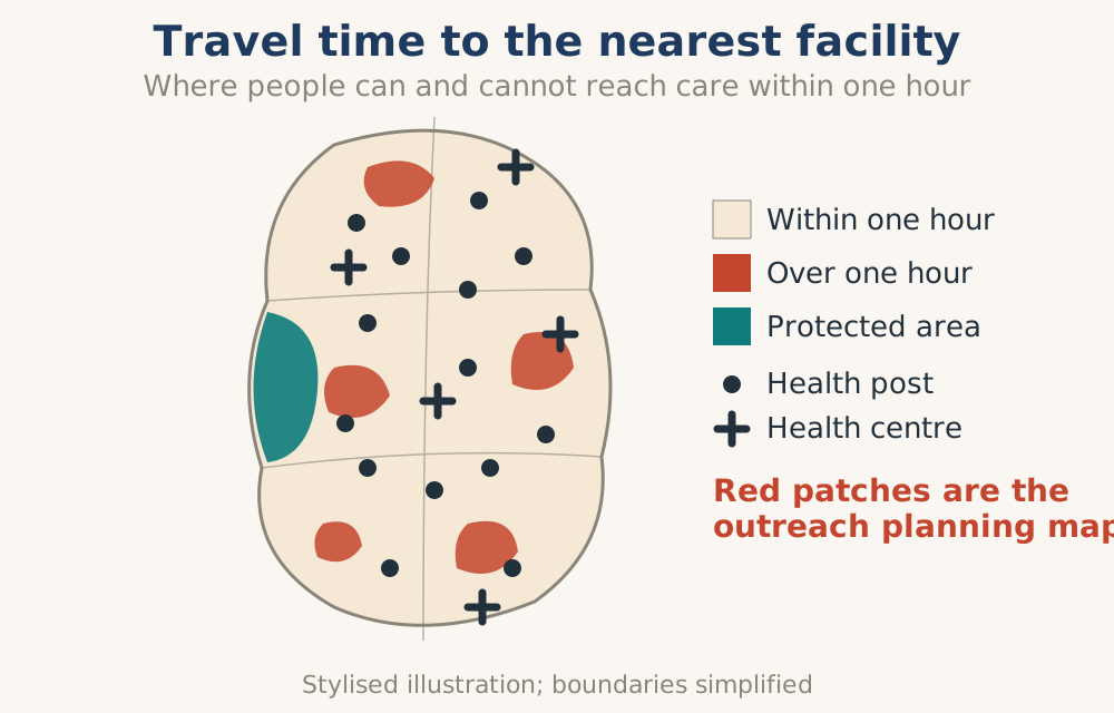
We can overlay patient homes with water sources, clinic catchments, road conditions, and even real-time weather alerts. We can animate time-sliding through weeks to watch an outbreak spread like ripples in a pond. We can create heatmaps that turn individual cases into glowing intensity surfaces, revealing hidden hotspots Snow could only imagine. And we can measure not just straight-line distance, but true travel time, showing that a clinic five kilometres away might as well be fifty if the seasonal river is flooded.
These capabilities do much more than produce prettier pictures. They fundamentally improve how we understand health data. A facility manager examining a traditional table of malnutrition rates might see nothing but numbers. But place those same numbers on a map, and suddenly a story emerges: the cases cluster not where food is scarce, but where the nearest clean water source is a two-hour walk away. The map generates a hypothesis that no spreadsheet ever could.
What does a good GIS map look like?
It must be legible in five seconds. A clean basemap, intuitive icons (a syringe for immunisation, a heart for hypertension), and no hunting through legends.
Every visible layer should whisper a possible action: red zones demand outreach visits, blue zones need restocking.
It must be interactive but not noisy: hover to reveal data, click to drill down, but defaults show only the three or four most important layers.
And finally, it must be timely. A map of last year's malaria outbreak is a history lesson; a map of last week's cases is a management tool.
For health workers on the ground, GIS maps become story-hunting devices. The process is almost playful.
A supervisor opens her map (made by the district information officer at her request) and starts toggling layers for her catchment area: maternal deaths, transport routes, traditional birth attendant locations. She notices one village with excellent antenatal registration but zero facility deliveries. That's the hook. She asks the information officer to add a layer showing seasonal river crossings. Now, with epidemiological thinking, the story unfolds: the village sits exactly between two traditional birth attendants, but both are on the far side of a river that becomes impassable for four months each year. The narrative shifts from "women refuse to come to the clinic" to "the clinic cannot reach them when it rains."
The action that follows, a monthly mobile clinic pre-positioned before the wet season, emerges directly from the map's silent testimony.
DHIS2 and GIS
DHIS2 has an app for making maps. These maps can be based on almost any visualisation allowed. DHIS2 also has access to the Google Earth Engine which can give population figures, rainfall, temperature, buildings and many other features. These can be created with a minimal base provided the user has skills using DHIS2. Various maps can be overlaid with different layers revealing different possible interpretation and analysis of population health.
Using data extracted from DHIS2 and imported into QGIS can add more layers into a map that are not currently available.
The use of the ESRI connector allows DHIS2 data to be imported directly into ARCGIS.
World Pop (University of Southampton) has developed population figures broken down into a grid sequence (100m x 100m) that can be allocated to form the population for a catchment area (worldpop.org).
The Crosscut App, a free, browser-based geospatial mapping and planning platform, can be used to optimise healthcare delivery, disease campaigns, and immunisation drives at the community level. It is available from the DHIS2 App Hub.
GIS special uses
Beyond routine health management, GIS reveals its deepest value in three high-stakes domains: equity, emergencies, and environmental threats. These analyses are usually made at a higher level, but the outputs need to be understood by frontline workers who will do the implementation.
Equity: On equity, a map has an unflinching honesty that spreadsheets lack. When a district manager layers child vaccination rates by village and then adds a layer of road quality and public transport stops, inequity becomes geography. She might discover that the lowest coverage is not in the most remote area, but in a peri-urban slum just three kilometres from the district hospital. Visual evidence is politically powerful. A map does not argue; it shows.
Emergency response: In emergency responses, time is measured in hours, and a static list of affected villages is useless without spatial context. When a flood or cyclone strikes, a GIS-enabled manager pulls up a real-time map overlaying the disaster zone with health facility locations, road statuses (green for open, red for blocked), and pre-identified evacuation shelters. She can instantly answer three life-saving epidemiological questions: Which clinics are still accessible? Where are the most displaced people likely to gather? Which chronic disease patients live inside the flooded area?
Environmental risk: For environmental risks, GIS transforms scattered sensor data into a continuous warning system. A health manager concerned about malaria does not wait for case reports. Instead, she watches a map that integrates satellite-derived rainfall, vegetation moisture, and temperature to predict mosquito breeding habitats weeks in advance. When the map shows a cluster of suitable breeding sites near villages with low bednet coverage, she can pre-position larvicides before a single child falls ill.
6.2.2 From a picture to a story
A graph is a picture. A story gives that picture meaning. The transformation from a simple visual to a compelling narrative is a structured process that lies at the heart of data-driven management. This is how you move from "seeing" to "understanding." All of this can be done without a computer, hand-made pictures and home-made stories are more powerful than flashy creations by complicated computers.
The analysis of a graph is an integrated two-step process that starts with
seeing the "nuts and bolts" of the graph and recognising the facts, but goes on to
interpreting and understanding the meaning by identifying and telling relevant stories.
This storytelling process is elaborated further in Chapter 7.
The nuts and bolts
Step 1: Start with Trusted Data
Before you draw a single line, you must trust the data quality. Use the self-assessment reports and data quality checks from Chapter 5 to ensure your numbers are correct, complete, and consistent.
A beautiful graph of bad data is worse than useless, it is misleading.
Step 2: Create the right visual
Your information team uses tools (Excel, DHIS2, GIS software, etc.) to create the visual according to the golden rules. This is the act of seeing the data.
Choose the right type of graph or map for the message you are exploring and for the audience who will be looking at it.
Step 3: Analyse for the Obvious
Your technical or programme team reviews the visual to identify the obvious: key trends, sudden changes, patterns, and anomalies.
This is the "what" of the story. What is happening? What does this picture show?
Step 4: Report the Facts
The data, now visualised, is packaged into routine monthly reports and tailored feedback reports as required. This is the "official" record and should be carefully stored.
Now, the story begins...
This process is elaborated further in Chapter 7.
Step 5: Look for the Interesting Story
Go beyond the obvious. The team looks at the visual and asks: What is interesting here? What is unexpected? What question does this raise? Perhaps one clinic is outperforming all others in a certain indicator. Perhaps a disease is showing a strange seasonal pattern.
This is the seed of your story.
Step 6: Contextualise the Story
A number alone is just a number. You must now add the local context. What happened in the community during this time? Was there a flood? A new health promotion campaign? A staff shortage? Influx of migrants?
This is the "why" and "how." Engage with frontline workers. Talk to community members. Gather the anecdotes and local knowledge that will breathe life into the data.
Step 7: Develop the Full Narrative
Weave the data, visualisation, and the context together. A story has a beginning (the situation), a middle (what happened, as shown by the data), and an end (the implication and the action to be taken).
"In January, our measles cases dropped to zero. This follows our December outreach campaign where we vaccinated over 300 children in the remote villages. This shows targeted outreach works. Our plan is to repeat this model for the polio vaccine."
Step 8: Communicate and Act
Share your story. Use the graphs and maps to make it engaging. Present it at a staff meeting, share it with the district, or show it to the community. A story shared is a story that can inspire action.
The final step is to use the PDSA process to act on the insights you have generated, using hand-drawn maps and home-made stories.
6.2.3 Special visualisations
Again, these special visualisations need computers, software and operators with advanced skills normally found at district or higher. Local managers do not need to know how to make them, but they need to understand how to use them to identify and solve problems.
Scorecards and league tables
Comparing performance across facilities or sub-districts can be a powerful motivator, but it must be handled with care.
When a nurse sees her clinic ranked third from the bottom for skilled birth attendance, two things can happen. The positive possibility: curiosity and healthy pride drive her to call the top-ranked facility and ask, "What are you doing differently?" The negative risk: shame and demoralisation lead to data manipulation or a narrow focus on the ranked indicator while other essential services collapse.
The antidote is thoughtful design.
Never rank on a single indicator alone; use composite scores based on programme performance.
Accompany every league table with a "peer group" filter so managers compare themselves to similar facilities (same catchment size, same rurality).
Frame rankings as a starting point for inquiry, not a final judgment.
A good league table whispers, "Let's learn together," not, "You are failing."
Example of a league table from Sierra Leone using light and dark colours, the dark colours indicating serious issues
| District | DPT 1 to 3 | OPV 1 to 3 | DPT3 to Measles 1 | Total |
|---|---|---|---|---|
| Kambia | 33.09 | 31.9 | 32.61 | 32.53 |
| Bombali | 28.49 | 29 | 33.92 | 30.46 |
| Bonthe | 23.69 | 26.7 | 35.1 | 28.51 |
| Moyamba | 22.38 | 22.6 | 30.81 | 25.27 |
| Tonkolili | 26.56 | 26.4 | 21.07 | 24.69 |
| Kono | 21.97 | 25.1 | 25.37 | 24.15 |
| Port Loko | 23.43 | 23.3 | 24.91 | 23.87 |
| Koinadugu | 24.77 | 23.6 | 22.47 | 23.61 |
| Western Area | 14.07 | 15.8 | 19.95 | 16.60 |
| Bo | 15.05 | 17.3 | 17.21 | 16.52 |
| Kailahun | 11.79 | 11.4 | 19.8 | 14.34 |
| Pujehun | 8.03 | 6 | 12.29 | 8.79 |
| Kenema | 7.75 | 5.1 | 5.15 | 6 |
| Total | 17.17 | 17.84 | 21.05 | 18.69 |
Table 6.A. District league table: dropout rates (immunisation), worst first. Sort order is the teaching point.
Immunisation Drop Out Rate Pivot table: The Total ‘column’ is an example of a composite score based on similar indicators. The ‘row’ Total is the average of each drop out rate. The total ‘column’ has also been set up to show the districts with the biggest drop out rate at the top. The higher the drop out rate, the worse the facility is doing.
Heatmaps and pivot tables
Tabular summaries showing each facility's performance against targets are invaluable for district managers.
League tables, which rank facilities from best to worst, add competitive energy.
Sometimes a manager needs to inspect large volumes of data from different perspectives, and that is where heatmaps and pivot tables shine.
A heatmap transforms a dense grid of numbers into a coloured canvas: high values glow in deep red, low values fade to pale yellow or blue. In a single glance, a district manager can see which weeks had the worst malaria spikes across ten facilities, or which vaccine lots expired most often in which cold chain units. The pattern leaps out before a single number is read.
| District | OPV0 | BCG | OPV1 | OPV3 | Penta3 | Penta 1 to 3 dropout | Penta 1 to measles dropout | Measles | Fully immunised under 1 |
|---|---|---|---|---|---|---|---|---|---|
| Bo | 22.45 | 37.95 | 37.39 | 30.92 | 31.49 | 15.05 | 17.21 | 30.69 | 31.55 |
| Bombali | 22.55 | 27.7 | 28.69 | 20.39 | 20.52 | 28.49 | 33.92 | 18.96 | 18.1 |
| Bonthe | 23.23 | 28.38 | 24.51 | 17.96 | 18.64 | 23.69 | 35.1 | 15.85 | 15.13 |
| Kailahun | 27.76 | 28.3 | 28.69 | 25.42 | 25.55 | 11.79 | 19.8 | 23.23 | 21.06 |
| Kambia | 16 | 22.36 | 17.63 | 12.01 | 12.39 | 33.09 | 32.61 | 12.47 | 10.1 |
| Kenema | 28.6 | 34.46 | 27.74 | 26.34 | 26.33 | 7.75 | 5.15 | 27.07 | 25.13 |
| Koinadugu | 11.15 | 14.63 | 16.21 | 12.39 | 12.43 | 24.77 | 22.47 | 12.81 | 12.6 |
| Kono | 11.7 | 18.24 | 13.99 | 10.48 | 10.88 | 21.97 | 25.37 | 10.41 | 7.9 |
| Moyamba | 31.69 | 37.66 | 39.6 | 30.65 | 30.66 | 22.38 | 30.81 | 27.33 | 25.67 |
| Port Loko | 13.78 | 23.05 | 19.94 | 15.3 | 15.38 | 23.43 | 24.91 | 15.08 | 12.84 |
| Pujehun | 21.29 | 22.06 | 23.9 | 22.45 | 21.98 | 8.03 | 12.29 | 20.96 | 20.35 |
| Tonkolili | 15.77 | 24.17 | 19.19 | 14.12 | 13.87 | 26.56 | 21.07 | 14.9 | 11.79 |
| Western Area | 95.26 | 101.42 | 76.87 | 64.75 | 66.49 | 14.07 | 19.95 | 61.94 | 54.85 |
| Total | 32.68 | 39.23 | 33.57 | 27.58 | 27.98 | 17.17 | 21.05 | 26.66 | 24.26 |
Table 6.C. District heat table: immunisation coverage and dropout for children under one year, three-step shading (teal good, gold middle, coral poor). One outlier district stands out against low coverage everywhere else.
| District | BCG | Penta 1 | OPV 1 | Penta 3 | OPV 3 | Measles |
|---|---|---|---|---|---|---|
| Bo | 38 | 37.1 | 37.4 | 31.5 | 30.9 | 30.7 |
| Bombali | 27.7 | 28.7 | 28.7 | 20.5 | 20.4 | 19 |
| Bonthe | 28.4 | 24.4 | 24.5 | 18.6 | 18 | 15.9 |
| Kailahun | 28.3 | 29 | 28.7 | 25.6 | 25.4 | 23.2 |
| Kambia | 22.4 | 18.5 | 17.6 | 12.4 | 12 | 12.5 |
| Kenema | 34.5 | 28.5 | 27.7 | 26.3 | 26.3 | 27.1 |
| Koinadugu | 14.6 | 16.5 | 16.2 | 12.4 | 12.4 | 12.8 |
| Kono | 18.2 | 14 | 14 | 10.9 | 10.5 | 10.4 |
| Moyamba | 37.7 | 39.5 | 39.6 | 30.7 | 30.7 | 27.3 |
| Port Loko | 23.1 | 20.1 | 19.9 | 15.4 | 15.3 | 15.1 |
| Pujehun | 22.1 | 23.9 | 23.9 | 22 | 22.5 | 21 |
| Tonkolili | 24.2 | 18.9 | 19.2 | 13.9 | 14.1 | 14.9 |
| Western Area | 101.4 | 77.4 | 76.9 | 66.5 | 64.8 | 61.9 |
Table 6.D. The same districts on six coverage indicators: the simplified view of Table 6.C.
Pivot tables, meanwhile, allow the same data to be "rotated", viewed by facility then by month, or by month then by facility, or by cadre of health worker then by clinical outcome, based on what data is being collected. This flexibility is useful for answering evolving questions as long as it is kept simple. A supervisor might start asking, "Which clinic has the lowest TB case detection?" then pivot to, "Does that clinic also have the fewest community health workers?" and pivot again to, "Is the problem only in men over 40?"
Reviewing the Immunisation drop out rate table for Sierra Leone, it is apparent that Kambia has the biggest problem. Looking deeper in this problem reveals that there are a few facilities that cause the biggest loss of children during the immunisation schedule.
| Facility | DPT 1 to 3 dropout | OPV 1 to 3 dropout | DPT3 to Measles 1 dropout |
|---|---|---|---|
| Under Fives Clinic | 54.4 | 54.7 | 58.1 |
| Kychom CHC | 49.5 | 41 | 12.6 |
| Kamassasa CHC | 43.2 | 43.2 | 25.7 |
| Rokupr CHC | 34.1 | 32.8 | 44.5 |
| Numea CHC | 25.7 | 26.3 | 27.4 |
| Mapotolon CHC | 22.6 | 23.4 | -2.3 |
| Mambolo CHC | 15.5 | 16.2 | 28.8 |
| S.L.R.C.S Clinic | 13 | 13 | 42.1 |
Table 6.F. Facility league table: dropout rates, worst first. The negative value at Mapotolon CHC (more measles doses than DPT3) is a data-quality signal, kept visible.
Immunisation Drop Out Rate Pivot table for facilities of Kambia district
Skilled Birth attendance rate showing that the lower the rate, the worse the performance
| District | Skilled birth attendance rate (%) |
|---|---|
| Moyamba | 59.65 |
| Western Area | 56.78 |
| Kenema | 52.23 |
| Kailahun | 50.51 |
| Bo | 46.25 |
| Pujehun | 45.25 |
| Bonthe | 41.36 |
| Kambia | 39.09 |
| Bombali | 33.46 |
| Tonkolili | 31.64 |
| Port Loko | 31.02 |
| Koinadugu | 29.51 |
| Kono | 24.23 |
Table 6.B. District league table: skilled birth attendance rate, best first.
| Chiefdom (Moyamba) | Skilled birth attendance rate (%) |
|---|---|
| Kaiyamba | 38.88 |
| Timidale | 44.61 |
| Ribbi | 48.57 |
| Bumpeh | 50.61 |
| Lower Banta | 51.34 |
| Bagruwa | 60.16 |
| Kori | 64.95 |
| Kongbora | 65.22 |
| Kargboro | 67.91 |
| Dasse | 68.45 |
| Kowa | 69.03 |
| Upper Banta | 72.26 |
| Fakunya | 79.82 |
| Kamajei | 103.87 |
Table 6.E. Chiefdom league table (Moyamba): skilled birth attendance rate, worst first; the drill-down companion to Table 6.B. Kamajei above 100% is a denominator artefact, kept as the teaching point.
SBA rate per district SBA rate per chiefdom for Moyamba district
A well-designed digital dashboard makes this pivoting feel like a natural conversation, not a technical exercise. The key is to keep it simple and offer these views as tabs or expandable sections, never forcing the user to build their own pivot table from scratch.
6.3 The command centre: Dashboards
A single graph or map is a tool. A dashboard is a command centre, usually made at district level or higher, and does nothing new but brings together multiple, related visualisations, graphs, maps, and key indicators onto a single screen to tell a comprehensive story that can be used by local managers.
It stands at the pinnacle of the digital maturity ladder (Chapter 11), building on good connections, data captured at source, solid technical foundations and a reliable paper system.
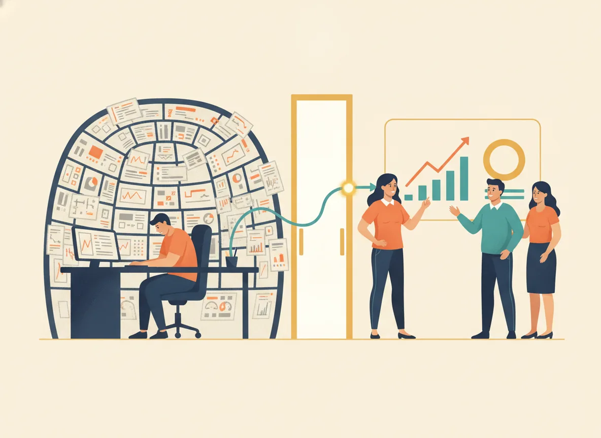
Dashboards need to be tailored to the needs of the end user. Think of a dashboard as a tool that needs to be different for a driver (car or motorbike), or a pilot or a health manager. It does not show the viewer every single piece of data about the vehicle, but shows a carefully curated selection of the most critical information needed to drive safely. The information needed to make decisions from the cockpit of an aeroplane is very different from that needed to drive a motorbike, and the dashboard should reflect this.
6.3.1 Principles of good dashboard design
A good Primary Health Care (PHC) dashboard for facility managers must transcend static number-tracking. A dashboard is not a random collection of charts. It is designed to answer a specific set of questions: "How is our facility performing against our annual plan?" or "What is the status of the current outbreak?" It should function as an exploratory command centre, turning indicators into a narrative that prompts action.
Below are the core principles. They are structured to foster interest, interactivity, and curiosity by local managers.
Glance then dive (progressive disclosure)
Overwhelming a manager with all information at once kills curiosity.
Instead, good dashboards use a tiled overview showing a few (about 5 to 7) vital signs: consultation volume, medicine stockouts, lab turnaround time, etc. Each tile is a teaser. Clicking or hovering expands a drawer with secondary trends, breakdowns by service point, and anomaly highlights.
This design respects the "5-second rule": a manager should grasp the facility's overall health in five seconds, then choose a thread to pull to follow the problem to a deeper level.
Contextual anchoring (from raw data to story)
Raw data (63 children vaccinated) or indicators ("80% child vaccination coverage") are inert. A curiosity-driven dashboard anchors each metric against a meaningful benchmark: the facility's own history (trend line), peer facilities (percentile rank), or national targets.
For example, a gauge that turns amber when "ANC dropout rate" exceeds the 3-month rolling average invites the manager to ask, "What changed in week 12?" Colour gradients should be used sparingly, only to signal deviation from expected norms, thereby preserving their emotional impact.
Make it actionable (curiosity loops and predictive teases)
A great dashboard poses unanswered questions. Use gentle predictive nudges:
"Based on current stock use, Albendazole will run out in 4 days. Tap to see ordering history."
Or a "mystery metric" card that changes weekly (e.g., "Did you know? Your Saturday triage speed is 30% faster. Explore why").
Incorporate small, low-stakes gamification: a "trend spotter" badge when a manager correctly identifies an emerging pattern (e.g., three consecutive weeks of rising hypertension visits).
Adapt to the setting (designing for different devices)
A PHC dashboard that works perfectly on a laptop in the district headquarters is useless if it cannot adapt to the real world. Facility managers and supervisors work across radically different settings, and good design respects each one.
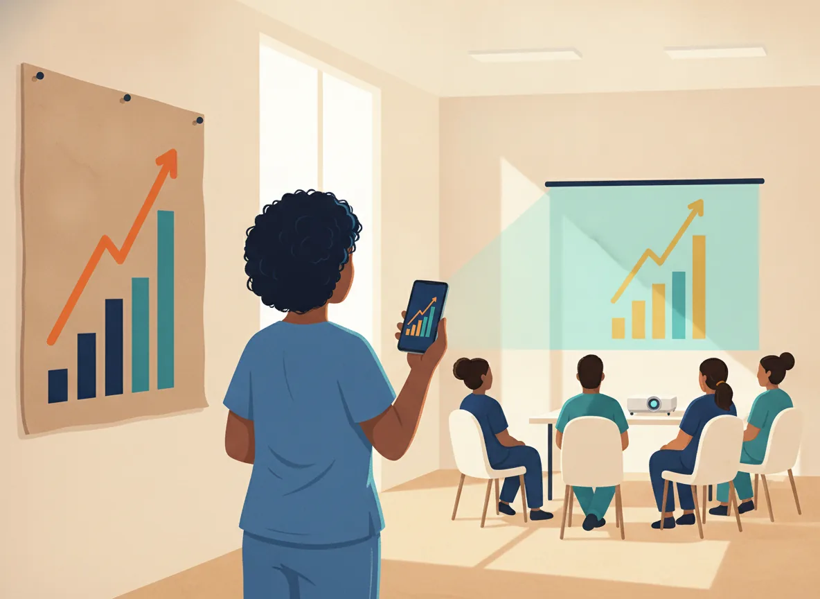
In a busy clinic waiting room, a wall chart remains essential. A large-print, laminated poster showing the last twelve months of key indicators, updated monthly with a marker, sparks conversations among staff and patients alike.
For a supervisor riding a motorcycle between remote facilities, the dashboard must exist on a mobile screen: offline-capable, thumb-friendly buttons, and a single-column layout that loads even on 2G networks.
For quarterly review meetings with dozens of attendees, a projected dashboard transforms group discussion. Here, the design must prioritise legibility from the back of the room: bold fonts, high-contrast colours, and animations that reveal data step by step rather than all at once.
The same dashboard should sense the device and adapt automatically, collapsing side panels on mobile, expanding tooltips on hover for wall-mounted touchscreens, and switching to a "presentation mode" for projectors.
In a busy clinic waiting room, a wall chart remains essential. A large-print, laminated poster showing the last twelve months of key indicators, updated monthly with a marker sparks conversations among staff and patients alike.
For a supervisor riding a motorcycle between remote facilities, the dashboard must exist on a mobile screen: offline-capable, thumb-friendly buttons, and a single-column layout that loads even on 2G networks.
For quarterly review meetings with dozens of attendees, a projected dashboard transforms group discussion. Here, the design must prioritise legibility from the back of the room: bold fonts, high-contrast colors, and animations that reveal data step by step rather than all at once.
Designing for these diverse settings is not a luxury; it is how data democratises and reaches every level of the health system.
Conclusion
The ultimate PHC dashboard feels less like a report and more like a mystery board. It rewards exploration with insight, not just data. By combining contextual anchors, progressive disclosure, playful micro-interactions, predictive teasers, spatial-temporal views, and gentle social comparison, programme and facility managers transform from passive viewers into active detectives, improving care not through obligation, but through genuine curiosity.
6.4 The future: Artificial intelligence and visualisation
We stand on the edge of a new frontier. Artificial Intelligence (AI) is poised to revolutionise how we visualise and interact with health data. It will not replace the skilled human analyst, but it will become an incredibly powerful partner.
At the moment, it is only available to those with high technical skills and sophisticated computers, but as the revolution advances, it will increasingly be available to frontline managers, even those with only a smartphone.
The incredible potential of AI
Predictive Analytics: AI can look at patterns in historical data, seasonality, environmental factors, and population movements to predict future outbreaks. Imagine a dashboard that does not just show you last month's malaria cases, but tells you: "Based on current rainfall and temperature patterns, we predict a 30% increase in malaria in the northern region in the next four weeks." This would allow you to pre-position supplies and activate prevention campaigns before the outbreak occurs.
Natural Language Interfaces: Imagine being able to "talk" to your data. Instead of navigating complex menus, you could simply type or speak: "Show me the five facilities with the lowest immunisation coverage for the last quarter." Or: "What is the trend in maternal deaths in the district over the last five years?" AI would instantly generate the appropriate visualisation and provide a summary.
Automated Anomaly Detection: AI can continuously monitor all your data streams, 24/7. It will instantly flag an anomaly: a sudden spike in a notifiable disease, a dramatic drop in a facility's reporting rate, and can even initiate an alert to the relevant manager. It acts as an ever-vigilant guard dog for your data.
Intelligent Storytelling: AI could analyse a dashboard and generate a first draft of a narrative report, highlighting the key trends and insights. It could suggest potential root causes based on correlations in the data and recommend possible actions.
Pattern Recognition Beyond Human Capability: AI can analyse complex, multi-dimensional datasets and identify subtle patterns and interactions that a human, looking at a 2D graph, would almost certainly miss. This could reveal new risk factors or uncover hidden relationships between health outcomes and environmental or social determinants.
This is not science fiction. These tools are being developed and deployed today. For the health manager, the arrival of AI means that the "eyes" of your RHIS will become far more powerful. They are like a 21st century telescope, seeing more, seeing further, and seeing into the future.
Your role will evolve from being the one who looks at the data to being the one who interprets and acts on the profound insights that AI brings to light.
Conclusion
The eyes of your RHIS are the tools you use to see the health of your community. From the humble hand-drawn graph on a clinic wall, a tradition that empowers and unites your team, to the sophisticated power of GIS maps and the emerging intelligence of AI, each tool has a vital role to play.
Your job as a manager is to master these eyes and help them to look at issues of concern to your team and your community.
Surround yourself with simple, clear graphs that reflect the epidemiological patterns of the annual plan.
Learn to interpret a map and find where the interesting equity stories are hiding.
Learn to navigate a dashboard to see the big picture and benefit from the full power of the command centre. And stay curious about the new tools on the horizon.
When you see clearly, you understand deeply. When you understand deeply, you can act decisively. And when you act decisively, you transform data from a static record of the past into a dynamic force for a healthier future.
Let the visualisations you create be the light that illuminates the path forward for your facility, your district, and your community.
CAPSTONE EXERCISE: The dashboard story
Task: You have been asked to present a 10-minute "data story" at your next district review meeting. You must use at least two different visualisation types (e.g., a hand-drawn graph, a GIS map, or a dashboard excerpt).
Prepare a one-page story outline that includes:
- The hook: What caught your attention? (One sentence.)
- The Action Indicators: Which five indicators from your annual plan are you focusing on? (Learning Objective 1)
- The visual: What graph types did you choose and why? (Learning Objective 2)
- The map: What spatial pattern does your GIS map reveal? (Learning Objective 3)
- The comparison: A scorecard, league table, or heatmap that puts your facility in context (Learning Objective 4)
- The dashboard: A sketch of your main dashboard view (Learning Objective 5)
- The action: One specific local action you are recommending based on this story.
- The question: One question you are leaving your audience with to stimulate curiosity.
Output for Capstone: One page. Practice telling it out loud in under 10 minutes. Present it to a colleague and ask: "Did this make you want to act?"
Example A: Step-by-step guide to making a hand-drawn graph
This example provides a simple, step-by-step guide for those who need extra support drawing graphs by hand.
- Choose the right graph type for your data (see Section 4.1).
- Draw the axes, horizontal (time or categories) and vertical (values).
- Label the axes, include units (e.g., months, percentages, numbers).
- Choose a scale, make sure it fits your data and is easy to read.
- Plot your data, carefully place each point or bar.
- Add a title, make it clear and descriptive (Indicator name and time period)
- Add the target line, show what you are aiming for.
- Annotate, circle the key insight, add a note explaining what it means.
- Update it regularly, a hand-drawn graph that is not updated is a dead graph.
References
- Healthcare dashboard usability study, 2024
- Healthcare dashboard design study, 2025
- NHS Business Services Authority, n.d.
- UK Statistics Authority, 2025
- World Health Organization, n.d.
- World Health Organization, 2023
- Dyers, 2026
- World Health Organization, 2023
- DHIS2, n.d.
- MEASURE Evaluation, n.d.