Information for Action
The senses of the system
Chapter 5 · Data Collection
Data collection as sensation: the moment reality becomes signal.

By the time you have read this chapter, you will be able to:
- Design or assess a data collection system using the six planning factors (needs assessment, stakeholder engagement, user-friendly tools, appropriate technology, capacity building, facility profile).
- Map the parallel data sources in your district (RHIS, EMR, laboratory, pharmacy, disease registers) and explain how they relate to one another.
- Diagnose and manage hybrid paper-digital workflows, identifying specific data quality challenges (double counting, transcription errors, time lags, inconsistent coding, missing data) and proposing a sequenced transition plan.
- Distinguish between EMR data and aggregate RHIS data, explaining what each can and cannot do for patient care versus facility management.
- Apply the Five Cs of data quality (Correct, Complete, Consistent, Current, Confidential) to a routine data element, trace errors to their source, and implement a corrective feedback loop.
Introduction
In a living health system, data collection is the act of sensation, the moment the body touches the world and transforms reality into signal. Without accurate sensation, the central nervous system (the HIS) cannot understand anything. The body cannot know if it is injured, cannot know if a treatment is working, cannot know if it is healing.
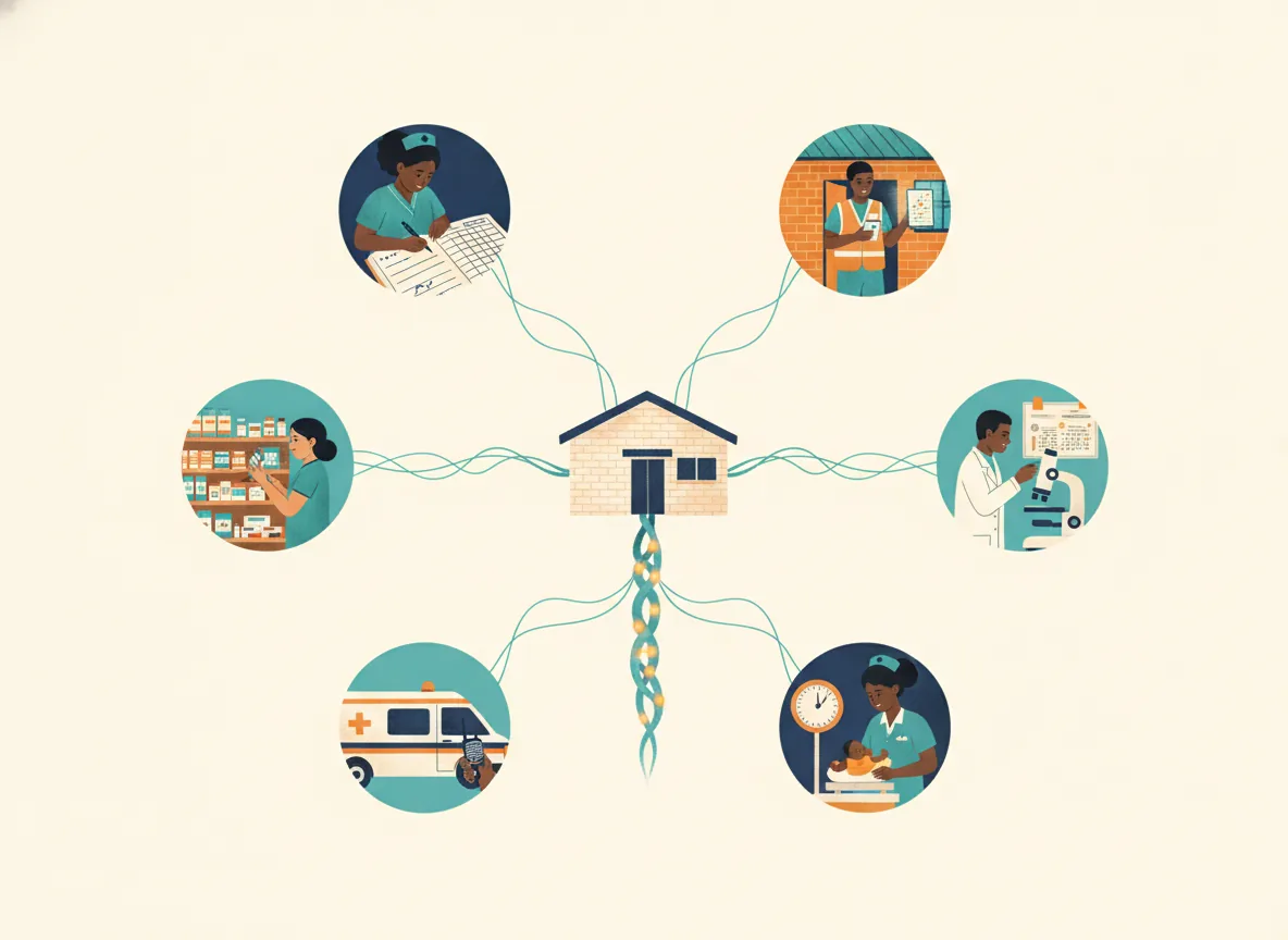
Yet sensation does not happen by accident on its own. It is the result of many deliberate decisions and actions taken by the mind of the system, the leadership and governance that design the sensory network before a single signal is ever captured.
This chapter traces the journey of data collection from its true starting point: the intentional design of a system that is simple, sustainable, and focused on what matters most, followed by actual collection of quality data from multiple data sources, through to processing to ensure quality information products that can be disseminated for further analysis by all stakeholders
5.1 Design and planning: Building the sensory network
Before any data can be collected, multiple decisions must be made. No systems are set up in a void and the first decision is that the existing legacy system is not functioning effectively and must be redesigned (by a multidisciplinary team) to serve local needs. The new system must then be designed with intention, clarity, and a deep understanding of local health priorities and minimal disruption to ongoing data collection processes.
A poorly designed collection system that collects too much data, burdens frontline workers, and serves only the needs of distant bureaucrats will fail, regardless of how diligently data is entered. Conversely, a simple, well-designed system, created in consultation with those who will use it, becomes a tool for empowerment rather than a source of frustration.
There will always be resistance to change when revising the RHIS and the (re)design process has to drive a fine line between the donors (usually the biggest problem with their excessive data demands) national level (bureaucrats, demanding such detail about every little activity and outcome, and maintaining the comfortable status quo) the district managers (usually interested in actionable indicators but often inexperienced in RHIS) and the health workers (clinically overworked, not really interested in data)
The following factors must be considered when designing or strengthening a data collection system.
5.1.1 Data needs assessment
The first implementation decision is to identify a minimal list of health indicators that sensitively reflect progress of each programme overall, including administrative elements (like pharmacy, finance and human resources), together with the data elements needed to create these key indicators for monitoring and improving health outcomes. This step involves understanding:
What health challenges are most pressing in the community?
How are these priorities reflected in annual plans?
What data enable calculation of indicators which reliably reflect progress (or lack of progress) in addressing these most pressing health challenges?
What decisions need to (can) be made at facility, district, and provincial levels?
What is the minimum amount of data needed to make those decisions?
Aligning data collection with genuine health priorities ensures that the information gathered is relevant, actionable, and worthy of the effort required to collect it.
Data overload is the most common problem in Information systems
5.1.2 Stakeholder engagement
An effective data collection system cannot be designed in isolation. Stakeholder engagement ensures that the system meets the needs of those who will use it and gains buy-in from those who will maintain it.
Key stakeholders include: Health care providers at all levels, Information managers and information team members, Community leaders and clients, policymakers at district, provincial, and national levels, both inside the health sector and outside it
The questions to ask stakeholders are:
How can we reduce the burden of data collection on frontline health workers?
What is the minimum amount of data needed to create valid indicators for each programme area?
How can stakeholders use this data locally to improve service delivery?
Regular feedback sessions help to refine the system based on user experiences and changing needs.
The biggest problem with achieving a minimum data set for a district is managing stakeholder expectations. RHIS planners tend to fall back on serving the needs of the donors with big pockets and loud mouths, rather than focusing on what is really useful to health workers. Planners, mostly economists, have a different perspective from programme managers at national level who have a different perspective from district level managers ... and all forget the priorities of communities and those outside the health sector (local government, agriculture, education)
5.1.3 User-friendly tools and clear roles
The human interface with the data collection system must be simple, straightforward, and intuitive, accessible to health workers even with limited technical expertise. This requires:
Clarifying roles and responsibilities for data entry, management, and quality assurance at each level of the system.
Developing standardised data definitions and recording formats to ensure consistency across facilities and prevent misinterpretation.
Creating clear standard operating procedures, job aids, and guidelines.
Defining data flow pathways showing how data will be collected, compiled, reported and used, ensuring a smooth flow of information from facilities to district and beyond.
Providing in-service training to ensure data quality and compliance.
A user-friendly system promotes consistent usage and reduces resistance to change among health staff.
5.1.4 Appropriate technology infrastructure
Technology for data collection should be appropriate, affordable, and sustainable in the current environment, and in the expected environment 10 years in the future. The one thing we can be sure of is that ICT will improve exponentially, particularly in remote, underserved areas. Considerations include:
Availability of necessary hardware, software, and internet connectivity, especially in rural areas.
A reliable support system, including technical assistance (maintenance and upgrades) and ongoing training (mentoring, supervision, distance learning).
Compatibility with existing (parallel) health information systems for data sharing and reporting.
Adherence to data privacy regulations to safeguard sensitive patient information.
A flexible system that can adapt to changes in the health landscape, emerging diseases, or policy shifts.
5.1.5 Capacity building framework
A sustainable data collection system requires a funded framework for continuous learning, as described in Chapter 10:
Supportive supervision, mentorship, and coaching whereby experienced users support new staff. This can usually be done remotely, with only the most intractable problems needing physical supervision
In-service training based on performance gaps, using a combination of trained district-level trainers, distance learning materials, and regular feedback.
Many countries have selected distance learning systems that are more efficient and less costly than face to face learning.
Pre-service training to ensure that all new recruits have the skills and knowledge to implement the RHIS from the start.
5.1.6 The facility profile: Knowing the foundation
Every facility is the foundation of the health care system. The RHIS should automatically produce an attractive, easy-to-access Facility Profile for every facility, updated annually and available at the touch of a button. This profile provides a brief, visually intuitive overview of the facility's performance against Action Indicators, its infrastructure, and operational status.
The profile should cover all systems: human resources, finances, service delivery, drug supply, and governance. When each facility documents the state of its infrastructure, basic equipment and staff needs, and updates the profile annually, local planning becomes dramatically easier when new resources become available. (See Example 1 for a detailed template.)
5.2 Data collation across source systems
In most health districts, data about the same patient or service delivery level flows through several parallel systems at the same time. A single patient encounter may generate data in the hospital administration system (registration), the Electronic Medical Record (EMR) for clinical care, the laboratory information system (test results), the pharmacy system (medication dispensed), a disease-specific register (TB or HIV), and the aggregate reporting tool (DHIS2).
Each of these systems serves a legitimate purpose, but they rarely speak to one another.
Why multiple sources exist: No single system can do everything. Laboratory systems are optimised for disease surveillance, tracking specimens and results. Pharmacy systems track stock levels and expiry dates. Aggregate reporting tools like DHIS2 are designed for monthly summaries, not individual patient tracking. Each system answers different questions.
How they relate to one another: At the district level, these sources are not merged into one perfect database. Instead, they are understood as complementary.
The RHIS (aggregate data from DHIS2) tells you how many patients were seen.
The EMR (individual patient data) tells you about specific patients and what happened to them over time.
The laboratory system tells you what tests were done and what the results were.
The pharmacy system tells you what was dispensed.
All of these systems, if integrated with each other give a complete story of health in the community served
What this means for facility and district managers: You receive many reports monthly, but the data does not come from a single source. Your monthly immunisation coverage report draws on register data (submitted by facilities), population estimates (from census or GIS), and possibly stock data (from the logistics system). Understanding this helps you interpret discrepancies. If coverage looks high but vaccine consumption looks low, the two sources are telling different stories. Neither is necessarily wrong; they measure different things. Your job is to understand the relationship between them, not to force them to match perfectly.
Practical solution for managers: Keep a simple map of your district's data sources and flows. Know which system is the "source of truth" for each indicator. When numbers do not align, trace each number back to its original source rather than assuming one is correct and the other is wrong.
Managing hybrid data flows: The reality of paper and digital together
Most facilities are neither fully paper-based nor fully digital. They operate in a hybrid world. A nurse may register a patient on paper, enter the same data into a tablet for HIV programme reporting, and the facility clerk may later enter a monthly summary into DHIS2 from the paper register. Different programmes within the same facility may be at different stages of digitisation. The result is a complex, often frustrating, flow of data.
Common hybrid workflows:
Paper register → monthly paper summary →some data entry by clerk, others only by nurse provider recording each action (immunisation, new FP acceptor, trauma care, these get summed each month and go to DHIS2)
Paper register → direct data entry into programme-specific tablet (e.g., for immunisations, TB, HIV, FP, ANC) → separate monthly summary for other programmes
Digital EMR at the consultation room → automatic aggregation for some indicators → but paper-based reporting for others because the EMR does not capture all required fields
Community health workers using paper forms → supervisor enters into mobile app → facility aggregates with its own data
Specific data quality challenges in hybrid systems:
Double counting: The same patient or event is recorded in two parallel systems and counted twice when reports are aggregated.
Transcription errors: Numbers are copied incorrectly from paper to digital, or from one digital system to another.
Time lags: Paper data sits in a drawer for days or weeks before entry, while digital data is available immediately. Reports that mix both sources are always out of sync.
Inconsistent coding: A diagnosis written in free text on a paper form is interpreted differently by two different data entry clerks.
Missing data: Fields that are mandatory in the digital system may be left blank on the paper form, leading to incomplete records.
Management challenges at district level:
Different reporting timelines for different programmes: Some facilities submit on the 5th, others on the 15th, depending on their level of digitisation.
Difficulty comparing facilities: A fully digital facility and a fully paper facility produce data of different timeliness and accuracy. Comparing them without adjusting for these differences leads to unfair performance assessments.
Staff frustration: Health workers perceive that they are doing double work entering the same patient information twice for two different systems. This erodes morale and data quality.
Transition sequence to digital
It is important to sequence the transition from paper to digital so that quality improves rather than degrades: A district cannot digitise everything at once. A practical sequence is:
- Start with the highest-volume or highest-risk programme. Immunisation or TB registers are good candidates because they are relatively simple and have clear denominators.
- Run paper and digital in parallel for at least three months. Use this period to identify discrepancies and train staff without the pressure of decommissioning the paper system.
- Compare data quality, not just speed. Does the digital system produce fewer errors? If not, fix the digital tool before proceeding.
- Decommission paper only when digital data is consistently more complete and timely. Keep paper as a backup for the first six months.
- Move programme by programme, not facility by facility. A facility that runs immunisations digitally but keeps TB on paper is manageable. A facility that runs half its programmes on paper and half digitally without a clear plan for integration is a problem.
Practical implication for managers:
Do not demand that every facility digitise at the same pace. Instead, set minimum data quality standards that apply equally to paper and digital. A facility using paper well is better than a facility using digital poorly.
Electronic medical records as a data source
Electronic Medical Records (EMRs) are increasingly common in district hospitals, and even below. However, they are often misunderstood as simply a "digital version" of the paper register. In fact, EMRs capture a different type of data that enables different types of analysis.
How EMR data differs from aggregate facility data:
| Feature | Aggregate data (DHIS2) | EMR data |
|---|---|---|
| Unit of analysis | Facility or programme | Individual patient |
| Time scale | Monthly or quarterly summaries | Encounter-level (daily, real-time) |
| Tracking over time | Cannot track the same patient across visits | Can follow a patient's entire care pathway across levels of care |
| Detail | Limited to a few indicators per patient | Full clinical data: symptoms, test results, examinations, prescriptions |
| Privacy | Low risk (no patient identifiers) | High risk (contains identifiable information) |
Advantages of emr (patient) data
Patient-level tracking: You can see whether the same patient returned for a follow-up visit, not just how many follow-up visits occurred in total.
Continuity of care: A clinician opening a patient record can see the patient's entire history at that facility, previous diagnoses, medications, allergies, test results. Paper registers scattered across different programme areas (FP, TB, minor Rx etc) cannot provide this.
Clinical cascades: You can measure, for each individual patient, whether they moved from testing to diagnosis to treatment to followup. Aggregate data only tells you how many people were at each stage, not whether the same people moved through all stages.
Outlier detection: You can identify individual patients who are falling through the cracks, those who tested positive but never started treatment rather than just knowing that the facility has a gap.
Surveillance: when notifiable disease reporting (for example, in South Africa) is linked to the lab system
Longitudinal analysis: You can measure time intervals between events (e.g., time from HIV diagnosis to ART initiation) with precision, not averages estimated from monthly totals.
How emr data relates to the RHIS:
The EMR and the RHIS are not competitors. They serve different purposes and should coexist with a clear relationship:
The EMR is the source of truth for individual patient care. If a clinician needs to know what happened to a specific patient, the EMR is the answer.
The RHIS (aggregate data) is the source of truth for facility and district management. If a manager needs to know immunisation coverage or whether the facility is meeting its targets, the RHIS is the answer.
Ideally, the RHIS is automatically populated from EMR data. A well-designed system does not require separate data entry for aggregate reporting. The EMR should generate the monthly summary automatically, though many do not yet do it
In reality, many facilities operate with both systems separately. This is acceptable as long as the facility understands the relationship and periodically reconciles the two sources.
Practical implication for managers:
If your facility has an EMR, do not abandon your RHIS reporting. Instead, work toward automatic data transfer from the EMR to the RHIS. If that is not possible, designate one person each month to compare the EMR-generated aggregate numbers with the manual RHIS submission and investigate large discrepancies.
Do not assume one is correct and the other is wrong. Assume they are telling different parts of the same story.
5.3 Data collection: Facility-level sensation
With the sensory network designed and built, the system can now begin its work of collecting data. This is the phase where the body touches the world, where the reality of patient encounters, service delivery, and community health is transformed into recorded signals.
5.3.1 Understanding data sources
Health information system data are generated from two fundamental sources: populations and institutions.
Population-based sources
These sources generate data on all individuals within defined populations, not only those who use health services:
Censuses: The "gold standard" for population estimates, providing the size, geographical distribution, and demographic characteristics of the population. Censuses should ideally be held every ten years.
Civil Registration: The continuous, permanent, compulsory, and universal recording of vital events live births, deaths, foetal deaths, marriages, and divorces. When coupled with medical certification of cause of death using the International Statistical Classification of Diseases (ICD), civil registration becomes a powerful source of vital statistics. Patient records should record ICDs for each encounter. When moved from paper to EMR this will provide a reliable picture of the disease pattern seen at each facility.
Population Surveys: Household surveys such as the Demographic and Health Surveys (DHS) and Multiple Indicator Cluster Surveys (MICS) generate data on child and maternal mortality, nutrition, service use, and health-related knowledge and practices.
Institution-based sources
These sources generate data from administrative and operational activities:
Individual Records: The basis of the RHIS, gathered during consultations with clients. These include documentation of health services, case reports, disease registries, and notifications of notifiable diseases. The main purpose of individual records is to help care providers deliver services to individuals and ensure continuity of care.
Service Records: Records from health service providers and from other sectors with health consequences, police records, veterinary services, environmental health authorities, and occupational health agencies.
Resource Records: Data on the quality, availability, and logistics of health service inputs-the density and distribution of health facilities, human resources, budgets and expenditures, drugs and core commodities.
5.3.2 The national indicator and data set (nids)
Every country (see chapter 2) should have a National Indicator and Data Set (NIDS) that is applied to all data sources, defines Indicators, establishes minimum data collection standards, and serves as the foundation for designing the data collection system. This data set should be reviewed regularly and revised as needed, ideally every two to three years. Unfortunately, most information systems are plagued by data overload -review results in additional data without reducing data items. Every discussion of NIDS should ask of each item:
Is this item necessary?
What indicator is calculated from it?
Does a change in its value make any difference to local programme management? To administrative insight? Financial implication? To insight into health progress? To community health? If not, don’t collect.
5.3.3 Data collection tools
Data collection tools should be designed with data gatherers as the focus. Whether digital or paper, they must be simple, clear, and purpose-built.
Digital tools
Health facilities have increasing access to digital tools including Electronic Health Records (EHR) systems, mobile health (mHealth) apps, and Routine Health Information Systems (RHIS). Advantages of digitisation include:
Improved accuracy: Digital systems minimise human errors through single data entry with validation checks.
Real-time availability: Data is available almost immediately, enabling timely decisions.
Enhanced efficiency: Streamlined workflows allow providers to focus more on patient care.
Better data management: Space-efficient storage, easy backup, and enhanced security.
Interoperability: Digital platforms enable collaboration between different health departments.
Paper tools
Paper tools will remain in use for the foreseeable future, particularly in poorer, more rural areas. Paper forms should be as simple and user-friendly as possible, custom-designed to include only the services actually provided by the facility.
Key paper tools include:
PHC Clinical Forms: A3 format forms for OPD triage, paediatric care, maternal and child health, ART and TB, rehabilitation, and mental health. These often include scannable stickers containing facility, patient, and diagnostic information.
Patient Record Cards: Patient-held records containing personal details, clinical history, diagnoses, and treatment from each interaction. These are legally binding documents in medico-legal disputes. Categories include Road to Health cards, Child Health booklets, Women's Health books, chronic disease cards and patient folders containing records of all visits and actions taken..
Integrated Stationery for PHC: A simplified tool for tallying identical data on conditions that do not require follow-up headcounts, minor ailments, children weighed, replacing older, more cumbersome tally sheets.
Registers: Records for conditions requiring continuity of care, antenatal care, immunisations, family planning, TB, chronic illnesses. Registers enable providers to identify patients who need follow-up or tracing in the community.
5.4 Data processing and analysis: From sensation to intelligence
Once data is collected, it must be transformed. Raw signals such as individual patient encounters, services delivered, commodities used must be aggregated, cleaned, and analyzed to become meaningful intelligence. This processing happens through the RHIS database (the national data centre), which serves as the central integration hub.
5.4.1 Population data: The denominator
To make sense of service data (the numerator) we must understand the population served (the denominator). Knowing who we are serving is foundational for public health and the philosophy of caring/ looking out for a community. Population figures are also essential for calculating rates and indicators, and updated information should be available at all facilities as part of the Facility Profile.
Catchment Population: Each facility must know the population it serves, but facility populations are notoriously unreliable. Even if not 100% accurate, population figures form the basis for all analysis using indicators (and resource allocations). The district information officer should work with facility staff using local mapping or GIS maps to determine catchment populations.
Target Population: Each priority health programme serves a different target group. The facility profile should contain estimates for each age group by sex, updated annually based on population growth rates. A simple population table displayed on the facility wall shows the population served by each programme and the expected monthly activity level.
Vulnerable groups: For equity we need to identify and count vulnerable groups such as pregnant teenagers, teens without access to FP, female-headed HHs, households with disability and areas of under-relative service
Geographic Information Systems (GIS): GIS enables planners to identify villages in the catchment area and calculate total population automatically. The basic standard is to draw a 5 to 10 km radius around the facility, adjusting for transport routes, geographic barriers, and social preferences. However many systems (GRID and Crosscut) offer detailed population analysis that is available for free to health workers.
5.4.2 Information processes
As data is entered into the RHIS (ideally digitally and directly at the point of care) it is ready to undergo a series of transformations that turn it from quality data to useful information:
- Data entry with automatic validation checks (max/min values, consistency rules).
- Data cleaning to remove duplicates and correct inconsistencies.
- Aggregation across time periods and facilities.
- Indicator calculation using standardised definitions from the NIDS.
- Visualisation into graphs, tables, scorecards, and maps.
The result is a set of data products, dashboards, reports, and visualizations that transform raw sensory signals into intelligence that can be understood, discussed, and acted upon (see chapter 6)
5.5 Dissemination and use: Closing the feedback loop
Intelligence that is not used is wasted. The purpose of the entire information cycle is to inform the health system (body) to visualise progress in health or to take action when there is something wrong. Dissemination and use (the response phase) closes the loop, sending intelligence as feedback to the where it was collected (the health facility ) to guide decisions, improve services, and strengthen the system.
The DHMT (and implementing partners) need to take a very direct hand in facilitating and finalising these later phases of the information loop by deploying substantial resources (staff and money) to keep data use and the feedback system functional. This is always a challenge
5.5.1 The monthly report
The monthly report is the key element in the process of self-assessment at each facility.
A good monthly health data report should be informative to all stakeholders:
Be based on selected action indicators from the annual plan, converted into charts, graphs, maps, and tables with accompanying analytical narrative.
Have a narrative that uses clear and simple language, avoiding technical jargon to explain what is happening in the visuals.
Be timely and regular, adhering to an agreed schedule.
Include insightful analysis highlighting trends and implications.
Incorporate stories and case studies for deeper qualitative insight.
Provide actionable recommendations guiding potential interventions.
Include comparisons with previous months and benchmarks from national targets.
5.5.2 Feedback mechanisms
Feedback loops ensure that data flows back to those who collected it and are dealt with in Chapter 7:
Health facility level: Staff use monthly feedback from the district during staff meetings as part of self-assessment.
District level: DHMTs provide monthly feedback to health facilities using standard RHIS dashboards, feeding into facility self-assessments, in-charges meetings, and quarterly data use meetings.
Supervision at each level provides the ultimate tailored feedback, whether remote or in-person
National level: National M&E provides feedback to DHMTs and programme managers through programmatic bulletins using standardised templates.
5.5.3 Notifiable disease reporting
Certain important diseases require immediate notification, not just monthly reporting, to detect and contain outbreaks. New cases of communicable diseases often need to be reported by phone to initiate rapid action. The notifiable disease system is a central part of epidemiological surveillance, ensuring that the body can respond to threats before they spread.
5.6 Data quality: The immune system across all phases
No data is ever perfect. The aim of data quality improvement is to achieve data that is trusted, good enough to tell a coherent story and sufficiently accurate to make informed decisions at local, district, and national levels.
5.6.1 The five cs of data quality
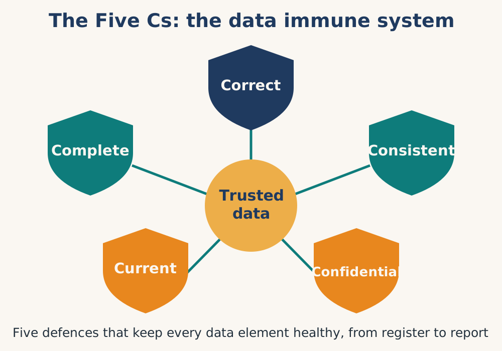
| Characteristic | Operational Definition |
|---|---|
| Correct | Data measured against a referenced source (the original documents where events were first recorded) and found to be accurate. |
| Complete | Data are present and usable, with no missing values in reports or source documents. |
| Consistent | Data show a consistent pattern when compared with previous months, show similar distribution of cases, and align with other indicators from the same facility. |
| Current (Timely) | Data are available when needed, up to date and available promptly to inform decisions. Timeliness target is 90%+. |
| Confidential | Client data maintained according to national and international standards, with appropriate security for both hard copy and electronic forms. |
5.6.2 Strategies to improve data quality
The best way to improve data quality is to reduce the amount of data collected, ensure good data collection tools and to support staff to do regular data quality checks, self-assessment, supportive supervision and tell feedback stories about their data.
If this is not designed in from the beginning, a data quality improvement plan is needed to make significant data improvements using four basic strategies.
All depend on trained staff doing the right thing every month based on standing orders, job descriptions and monthly outputs, designed as part of the system. Improvements need change management to be properly resourced, preferably with ringfenced allocations of staff time (job descriptions, work aids) and resources (mainly travel) for feedback and supervision.
Data Quality Review: Regular review by data capturers, computer systems, and information teams using:
Automatic digital quality checks (validation rules, min/max values)
Digital data quality assessment tools (e.g., WHO Data Quality App)
Monthly data quality reviews and internal audits
Self Assessment: Local analysis using Action Indicators to assess progress toward targets:
Prepare a predefined set of 3 to 5 Action Indicators each month
Create standardised self-assessment dashboards
Discuss, analyze, and identify relevant stories
Feedback and supervision: Establish digital feedback loops where staff can report and correct errors promptly, and supervisors can interact with and inform data collectors on quality issues.
Digital data quality checks
- Digital Data Entry: Direct digital entry at the point of care using tablets radically improves accuracy through validation checks, single entry, and real-time feedback. This is a very cost-effective intervention as long as the tablets don't disappear, there is a reliable power source to charge them, the software is maintained, and technical support is available.
5.7 Data quality tools
In addition to using data, there are many standard data quality tools embedded within RHIS software such as DHIS2:
Data input validation: The most basic way of data quality check is to make sure that the data being captured is correctly formatted. The DHIS2 gives the user a message that the value entered is not the correct format and will not save the value until it has been changed to an accepted value. E.g. text cannot be inputted in a numeric field.
Min and max ranges: To stop typing mistakes during data entry (e.g typing ‘1000’ instead of ‘100’) the DHIS2 checks that the value being entered is within a reasonable range. This range is based on the previously collected data by the same health facility for the same data element, and consists of a minimum and a maximum value. As soon as a user enters a value outside the range, the user will be alerted that the value is not accepted. In order to calculate the reasonable ranges the system needs at least six months (periods) of data.
Validation rules: A validation rule is based on an expression which defines a relationship between a number of data elements. The expression forms a condition which should assert that certain logical criteria are met. For instance, a validation rule could assert that the total number of vaccines given to infants is less than or equal to the total number of infants.
The validation rules checks are also built into the data entry process so that when the user has completed a form the rules can be run to check the data in that form only, before closing the form.
Outlier analysis: The standard deviation-based outlier analysis provides a mechanism for revealing values that are numerically distant from the rest of the data. Outliers can occur by chance, but they often indicate a measurement error or a heavy-tailed distribution (leading to very high numbers). In the former case one wishes to discard them while in the latter case one should be cautious in using tools or interpretations that assume a normal distribution. The analysis is based on the standard normal distribution.
Completeness and timeliness reports: Completeness reports will show how many data sets (forms) that have been submitted by organisation unit and period. You can use one of three different methods to calculate completeness; 1) based on the completeness button in data entry, 2) based on a set of defined compulsory data elements, or 3) based on the total registered data values for a data set.
The completeness reports will also show which organisation units in an area are reporting on time, and the percentage of timely reporting facilities in a given area.
5.7.1 What to do when you find errors
Find the cause: Go back to the person who collected the data, point out the problem, and ensure they understand the need for accuracy.
Correct the error: Return to the source data (tablet, register, or patient card) and obtain the correct number. Always write an explanation in the "comments" space.
Prevent future errors: Ensure the data collector understands the importance of the data item. Check this item next month to ensure the error does not recur.
Roles and responsibilities for data quality
Data quality is everyone's responsibility, with clear but different roles at each level:Add to each level visualisation of key indicators on progressive (month to month) graphs
| Health Facility | Enter data daily, perform validation checks, discuss data at every opportunity, conduct self-assessment, and store data securely. |
|---|---|
| District Level | Use RHIS data quality tools, provide monthly feedback to facilities, train staff, conduct quarterly supportive supervision, and perform in-depth assessments annually. |
| Provincial Level | Check data quality using computer tools, make standard graphs, sign off data by the 15th of the month, and provide standardized feedback. |
| National Level: | Provide strategic direction, institutionalize data quality SOPs, train district officers, conduct supportive supervision visits, and coordinate data quality review meetings. |
Conclusion: The sensory network in action
The collection of data is not merely a technical exercise. It is the act of sensation, the moment the health system touches reality and turns a patient encounter into a usable signal. Without this sensation, the system is numb: it cannot know if it is injured, if a treatment works, or if it is healing. A well-designed sensory network is therefore not a database or software package. It is a deliberate, human-centred architecture defined by six core decisions: a ruthless data needs assessment (only what is needed for action), genuine stakeholder engagement (frontline workers as co-designers), user-friendly tools (offline, durable, simple), appropriate technology (solar, SMS, rugged tablets), a funded capacity-building framework (mentorship, not just workshops), and a facility profile that knows its population and denominators.
These deliberate actions capture the signals that matter most. When those signals are processed into intelligence and fed back to the periphery, as charts, monthly self-assessments and supportive feedback, health workers, managers, and communities gain the confidence to act and solve problems. Yet the reality of parallel systems (RHIS, EMR, stock, community), hybrid paper-digital flows, and unintegrated EMRs means the goal is never a single perfect system.
The goal is a coherent understanding of how the different parts relate, the ability to triangulate discrepancies without forcing false matches, and the discipline to close the feedback loop so that data returns as wisdom, not waste. When each facility knows its population, uses simple standardised tools, and engages in continuous self-assessment, the information cycle becomes virtuous: quality improves, use increases, and the system grows stronger with every turn.
CAPSTONE EXERCISE: Strengthening the data collection system (Southern Region briefing)
Task: You have been asked to present a 10-minute briefing to your district management team on "How We Can Strengthen Our Data Collection System in the South Region."
Using what you have learned from this chapter, prepare a one-page briefing note that answers:
- Design (LO1): What is the minimal data set for a remote dispensary like Date?
- Triangulation (LO2): How will we reconcile RHIS, CHW, and stock data at Cherry?
- Hybrid flows (LO3): What is the simplest paper-digital flow for Guava?
- EMRs (LO4): What can we learn from Mango Hospital's EMR that applies to the south?
- Data quality (LO5): How will we prevent Fig's impossibilities next month?
Then: Treat this briefing as a small test. Present it to a colleague who works in a southern facility. Ask: "Would this work at your facility? What did I miss?" Use their feedback to revise.
Output for Capstone: One page data collection model .
References
- World Health Organization, 2023
- World Health Organization, n.d.
- World Health Organization, n.d.
- Routine Health Information Network (RHINO), n.d.
- Agency for Healthcare Research and Quality (AHRQ), n.d.
- World Health Organization, 2025
- World Health Organization, n.d.
- World Health Organization, n.d.
- World Health Organization, n.d.
- MEASURE Evaluation, n.d.
The following examples provide practical tools for implementing the principles in this chapter:
Example 1: Facility Profile Template
This contains data that can describe the facility and is always available and up to date
This is NOT a Health Facility Service Availability and Readiness survey. It is aimed at establishing a status base line of key areas of knowledge required for ongoing facility management. Some of the fields can be restricted to a predetermined list.
| Facility code | From a Master Facility List |
|---|---|
| Facility type | Drop down list |
| Street Address/location | |
| GIS coordinates | |
| Management authority | Drop down list |
| Contact details Phone number WhatsApp number of manager | |
| Facility owed radio or phone for contact | |
| Internet access | Drop down list |
| Staff formally allocated (medical professional) Staff formally allocated (nursing professional) Staff formally allocated (midwife) Staff formally allocated (pharmacist and/or other professional staff) Staff formally allocated ( EHO) Staff formally allocated (other) | |
| Building type Roof | Example: brick, bamboo, concrete Example: Straw, tile, zinc plates |
| Building status | Example: New, needs some maintenance, needs urgent repair, about to collapse |
| Power supply (for cold chain) | Example: Electricity, solar, generator |
| Water supply Water supply availability inside facility | Example: Connected to main supply, well in grounds, Example:Water available in all necessary rooms via plumbing system Water manually carried to necessary rooms |
| Consulting rooms | Only used for consultations |
| Dispensary | Drop down list |
| Rubbish removal | Collected by outside provider Burnt onsite ar regular intervals |
| Medical waste removal | Collected by outside provider Placenta pit on site |
| Toilets for patients/clients (functional) | |
| Staff rest room | |
| Staff toilet (functional) |
Example 2: Data Quality Roles and Responsibilities (Detailed)