Information for Action
Stories
Chapter 7 · Stories for Action
Stories move data from interpretation to action, and feedback closes the loop.

By the time you have read this chapter, you will be able to:
- Identify at least three types of hidden stories (deviation, trend reversal, cumulative consequence) within routine data using basic curiosity and visual exploration.
- Construct a data story using the beginning, middle and end narrative arc, supported by appropriate visualisations.
- Differentiate between push, pull, and dialogic feedback mechanisms and select the most appropriate one for a given audience (frontline worker, manager, policy maker, or community member).
- Explain how storytelling transforms raw feedback into actionable, blame-free, and memorable communication.
- Apply traditional storytelling techniques to engage communities and close the information cycle through empowerment rather than compliance.
- Trace the link between curiosity, epidemiological thinking, and increased demand for data within the information cycle.
7.1 Stories: A core part of routine data
We live in a world drowning in data. Routine data pours in weekly, monthly, daily, drably from every facility, filled by bored clerks who never look at the data. Raw numbers, even beautiful graphs, can leave people feeling overwhelmed or, worse, indifferent. This is where data storytelling enters.
"Many bold, incredible insights will be ignored if they are not successfully moulded into data stories. Uncovering key insights is one skill and communicating them is another, both are equally important."
Dashboards and reports tell you the facts about what happened. They rarely tell you why. They lack narrative and context. And without those, even the most accurate analysis stays trapped on the interpretation page. People see the numbers but even though they understand, don't know what to do with them.
A story changes that. A story moves data from interpretation to action.
When a story leads to action, and that action produces visible results, something wonderful happens: demand for information increases as people start asking questions. Did our action work? What changed? What next? That action closes the information-to -action cycle (see Chapter 2) and starts it spinning again. Storytelling is not a pretty add-on. It is the engine that keeps the cycle moving. It is what turns a passive nervous system into an active, learning body.
Curiosity helps you find the story. But what makes you say it? English has no single word for this drive and even Gemini struggles (Mythopoesis, Narratophilia, Story-hunger). It is not stewardship, not duty, not generosity or responsibility, not urgency, though it borrows from all. Call it the storyteller's impulse. Call it the compulsion to close the loop. Whatever you name it, it is the force that turns private insight into public action. And without it, feedback has nothing to respond to.
Empowerment through stories
Throughout this manual, we have emphasised that data is not an end in itself. The purpose of collecting and using data is to improve primary health care. Here we add an important distinction: storytelling is not about persuading people. It is about empowering them. An empowered facility health team is like a body whose nervous system works in both directions, sensing, interpreting, and acting on its own behalf.
An empowered community or team understands its own data, sees its own patterns and problems, feels capable of acting on what it learns, and demands better data and feedback.
Traditional topdown data use says: “We have analysed the data. Here is what you must do.”
Storytelling-based data use says: “Here is what the data shows. What story does it tell you? What will you do differently?”
The first creates compliance. The second creates ownership. This chapter is about the second approach.
7.2 What is data storytelling?
Data storytelling is the art of translating complex data into a compelling narrative. It combines analysis and visuals with storytelling principles to convey insights in a way that resonates and inspires action. In this book, its highest purpose is to empower health workers and communities and to close the information cycle by providing useful feedback to the people who collected the data.
Data storytelling is the bridge between having data and using it. In the body analogy, storytelling is what transforms a nerve impulse into a meaningful sensation, and then into a purposeful movement.
The foundations of storytelling
Effective data storytelling rests on three foundations, data, narrative (with story arc), and visuals
Trusted data: The source
Without reliable, well analysed quality data, even the best story fails. Use descriptive, diagnostic, predictive, and prescriptive analysis to understand the full picture.
Narrative: The storyline
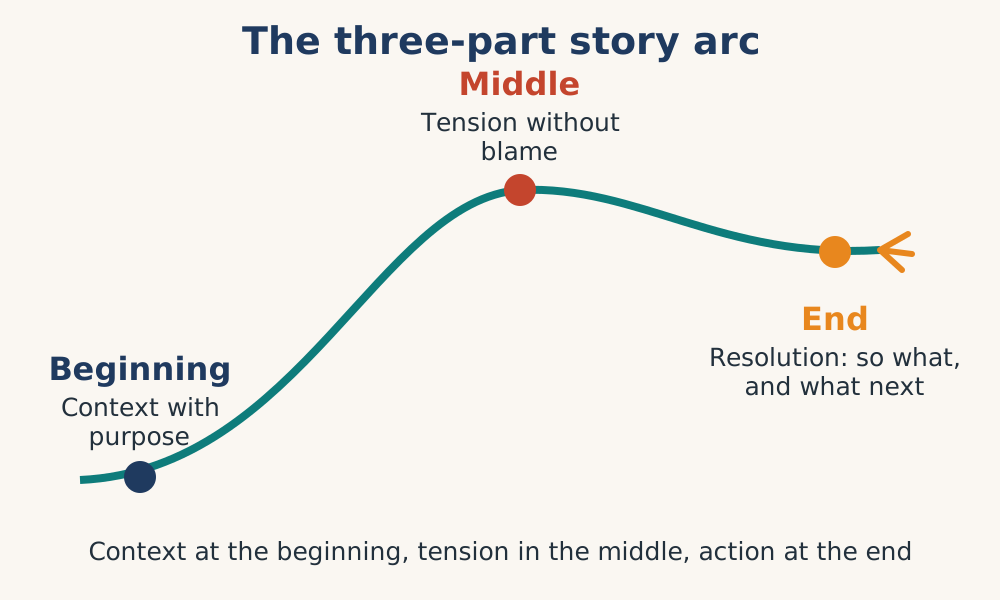
A strong narrative has three phases, the story arc:
Beginning (Context): Sets the scene, orient the audience and describe why it matters.
"At the start of the year, all five clinics achieved over 90% immunisation coverage."
Middle (Tension): Reveals the tension, unexpected change or problem.
"In month four, Clinic A dropped to 70% while others rose. Stockouts occurred at the same time as staff went on holidays."
End (Resolution): Answers "So what?" and drives action.
"Retraining staff to restock before holidays brought Clinic A back to 88%. Weekly stock reviews can prevent future drops."
A story without a beginning leaves the audience lost. Without a middle, there is no excitement, no tension. Without an end, there is no action.
Visualizations: The evidence
Maps, graphs, and pictures (Chapter 6) make the story more memorable. Many patterns remain hidden in spreadsheets without good visuals. Support each phase of the story:
The right combination of data, narrative, visuals, and arc produces a story that drives change. If an insight isn't compelling, no one will act.
7.3 Finding a story
To tell a story we need to look inside the data, identify interesting patterns and look for visual evidence to back it up to the audience, who must be clearly identified
Curiosity: Finding the hidden story
Routine data, weekly reports, monthly totals, daily logs, can seem boring. But stories hide everywhere. You just need basic curiosity and know what to look for.
Look for Three Things
- Connections: Unexpected relationships between variables.
- Trends: Changes in illness patterns, service use, or performance.
- Surprises: Data that doesn't behave as expected. Ask why? This is where the best stories live.
| Three Universal Story Patterns | ||
|---|---|---|
| Story Pattern | Description | Example |
| Deviation | Expected vs. actual | "We planned for 100 patients; we saw 60." |
| Trend reversal | Sudden drop or rise | "After six months of growth, visits fell by 30% in one week." |
| Cumulative consequence | Small changes adding up | "Losing 2% per month is 24% per year." |
Building your narrative: From structure to story
With your data analysed and visualised, your audience identified, it's time to build the narrative. Here is a practical, step-by-step method.
Step 1: Clarify Your Core Message
Answer three questions: Who are you talking to? What do you want them to know or do? Which data best supports that point?
Step 2: Shape the Beginning, Context with Purpose
Don't just state the baseline. Make it relevant.
Weak: "Here are our monthly totals."
Strong: "For the first four months, your team was the only one meeting its target. This is the story of how that changed."
Step 3: Shape the Middle, Tension Without Blame
Name patterns, not people. Blaming shuts down empowerment.
Weak: "Clinic B failed in May."
Strong: "In May, Clinic B dropped by 15% while others rose. The difference? A two-week stockout that has since been resolved."
Step 4: Shape the End, Action, Not Just Conclusion
Your audience should leave knowing what to do next.
Weak: "So Clinic B recovered in June."
Strong: "Clinic B recovered within two weeks of restocking. We recommend weekly supply reviews for all clinics."
Step 5: Test the Narrative Flow
Read your story aloud to someone unfamiliar with the data.
Ask: Did you understand the situation? Did you feel the tension? Do you know what to do next? If any answer is no, revise.
A good story takes the audience on a journey. Context at the beginning, tension in the middle, action at the end.
7.4 Feedback
Now we come to the second pillar of this chapter: feedback.
Feedback is information returned to a source to influence future performance.
It is how you close the loop between what data shows and what people actually do. Without feedback, the information cycle stops at interpretation so staff know what the problem is, but do not take action. With feedback, the cycle completes and begins again.
Reporting: Tells you what happened, but flows only one way. While it informs, it is Passive
Feedback: Flows back to the data source and tells you what to do differently. It is Interactive and reaches out to you to influence actions
In the body analogy, feedback is the reflex loop. Your hand touches something hot, the nerves send a signal to the spinal cord, and almost instantly a signal comes back telling the hand to pull away. That is feedback. It is fast, local, and lifesaving. Without it, the body burns. Without feedback, organisations and communities keep making the same mistakes, and get burned in the process.
Feedback turns data collection into a learning system. Without it, data is just history. With it, data becomes a tool for improvement.
From feedback to curiosity: The epidemiological link
Chapter 3 introduced epidemiological thinking, the habit of asking "who, what, where, when, and why" about patterns. Here is the link: patterns are the basis for epidemiological analysis, curiosity finds stories, stories stimulate curiosity, and curiosity increases demand for data.
Watch how this works:
- A story is told: "Clinic A dropped DPT3 coverage by 15% in May while others rose." (action indicator)
- The listener becomes curious: "Why only Clinic A? Why only May?"
- Curiosity drives action: "Let me check stock records. Let me look at staffing. Let me have a deep dive into June's data." (action indicators and problem solving indicators)
- Demand for data increases: People start asking for more analysed, detailed reports.
Stories are the engines of curiosity. They transform passive data recipients into active data seekers, the very heart of epidemiological thinking.
7.5 Feedback mechanisms and methods
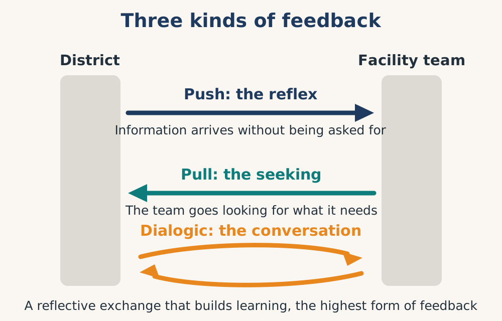
There are three main types of feedback: push, pull and dialogic. Each has its place.
| Feedback types | ||||
|---|---|---|---|---|
| Analogy | Description | Best for: | Example | |
| Push Feedback | Automatic: Body's reaction to warning signals, pain, heat | Scheduled, automated alerts, graphs, | Routine monitoring, flagging exceptions. | Stockout alert: supplies below minimum level." |
| Pull Feedback | Active: Scratching an itch or turning your head toward a sound. You actively seek the signal you need | Users actively seek out information from dashboards etc. | Self-directed exploration and improvement | A manager compares her clinic with neighbouring clinics. |
| Dialogic Feedback | A reflective learning conversation that enables (double) loop learning, not just reaction. | Supervision visits, structured meetings, data reviews, | Complex problems, blame-free learning, community empowerment. | A monthly clinic review discusses challenges, or A community dialogue ending with "What should we do differently?" |
| Choosing the Right Mechanism | ||
|---|---|---|
| Audience | Mechanism | Why |
| Frontline worker | Push + Dialogic | Builds competence and confidence |
| Manager | Pull + Push | Enables self-directed analysis |
| Policy maker | Pull + Dialogic | Balances detail with strategy |
| Community member | Dialogic + simple visuals | Empowers through participation |
A worked example: Feedback from routine immunisation data
Let's walk through a complete example, keeping the information cycle and community empowerment at the centre.
The Routine Data
A district manager receives data on monthly full immunisation coverage by one year for 12 months from five clinics. She draws graphs and does a comparative analysis
Step 1, Find the Story
Four clinics show steady improvement. One clinic, Clinic A, dropped sharply in month four, recovered partially, but never returned to its original level.
Step 2, Build the Narrative Arc
| Phase | Content |
|---|---|
| Beginning | "At the start of the year, all five clinics were above 90%. Clinic A was the highest at 95%." |
| Middle | "In month four, Clinic A dropped to 70% while others stayed above 90%. The drop coincided with a two week stockout and staff absence." |
| End | "After restocking, Clinic A recovered to 88%. Monthly stock checks could prevent future drops. Let's review week 10 together." |
Step 3, Tailor for Different Audiences
| Audience | Version of the Story | Empowerment Goal |
|---|---|---|
| Clinic A nurse | "You were doing great until month four. Let's learn from that, no blame. What would help you stay on track?" | Build confidence problem solving |
| District manager | "One clinic dropped significantly. The pattern suggests stockouts. What resources can we deploy to support them?" | Enable resource allocation |
| Community member | "Let me tell you about the children at Clinic A. For months, nearly all were vaccinated. Then for two weeks, many missed out. The clinic fixed the stock problem. Now we need to bring those children back. Can you help spread the word?" | Mobilise collective action |
Step 4, Deliver as Feedback
The district manager contacts Clinic A and explains her findings. During a break, the manager holds a 15-minute dialogic review with her team, starting with the story, then asking “What do you think contributed?” and ending with a shared action plan. The team leaves feeling heard, not blamed.
Step 5, Observe the Cycle Restart
One month later, Clinic A is back to 92%. The district manager sends a push alert: "Great work. Let's document what changed so others can learn." The data clerk is now making tailored reports for the manager to stay informed.
The information cycle has accelerated because a story created curiosity, feedback created action, and action created demand.
| Common Pitfalls and How to Avoid Them | |
|---|---|
| Pitfall | Mitigation |
| Over-narrating | Stick to what the data shows. One clear insight beats five vague ones. |
| Confusing correlation with causation | Use "coincided with" or "was followed by" without proof of causation. |
| Feedback that arrives too late | Match frequency to the pace of work. Weekly may be needed locally. |
| Feedback that is too aggregated | Disaggregate. Show each team their own data. |
| The story that blames | Name patterns, not people. Focus on systems. |
| The story without an end | Every story must end with a specific action. |
| Forgetting empowerment | End every story with a question: "What will you do?" |
Feedback pitfalls
Effective data storytelling transforms routine numbers into actionable insights, but managers often face pitfalls that hinder communication. Common traps like over-narrating, confusing correlation with causation, or blaming individuals can quickly derail the feedback loop.
To mitigate these, managers should focus on clear, systemic patterns instead of personal faults, ensuring every story drives actionable change. Managers must tailor feedback to be timely and relevant, avoiding over-aggregation by showing teams their specific, localised data.
By framing feedback as an empowering dialogue rather than a command, managers cultivate team curiosity and close the information cycle effectively.
Common pitfalls and how to avoid them
| Pitfall | Mitigation |
|---|---|
| Over-narrating | Stick to what the data shows. One clear insight beats five vague ones. |
| Confusing correlation with causation | Use “coincided with” or “was followed by” without proof of causation. |
| Feedback that arrives too late | Match frequency to the pace of work. Weekly may be needed locally. |
| Feedback that is too aggregated | Disaggregate. Show each team their own data. |
| The story that blames | Name patterns, not people. Focus on systems. |
| The story without an end | Every story must end with a specific action. |
| Forgetting empowerment | End every story with a question: “What will you do?” |
7.6 Traditional storytelling and community empowerment
Before dashboards or written language, human communities used stories to share knowledge, warn of dangers, and coordinate action. Traditional storytelling remains a powerful, though underused tool for data use, and for empowerment.
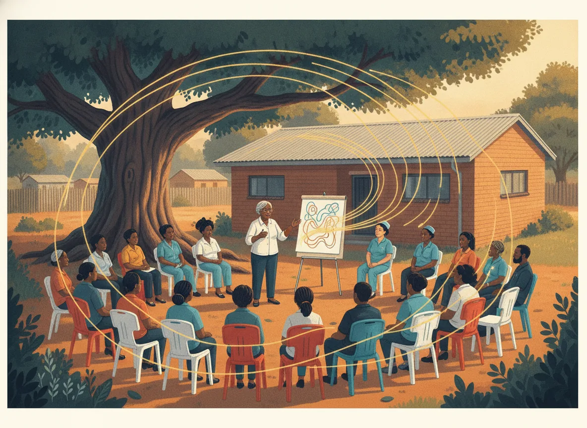
Traditional storytelling in a data context means using oral narratives, parables, case studies, and community dialogues, with familiar cultural forms like proverbs, analogies, or call-and-response to convey information.
When linked to routine data, traditional storytelling can:
Translate numbers into lived experience: Instead of "70% coverage," say "Last season, seven out of ten children received the vaccine. Three did not. One of those three fell ill."
Make data memorable across generations: Oral stories are repeated, adapted, and remembered far longer than printed reports.
Reduce suspicion of data: In communities where "data" feels like an external imposition, a story from a trusted community member feels familiar and safe.
Enable two-way feedback: Traditional storytelling is dialogic. Listeners interrupt, ask questions, and offer their own versions. That is feedback in its purest form, and empowerment in action.
A worked example
Routine data shows that maternal health visits drop sharply during the rainy season.
Topdown approach: A report is sent to the district office. No change occurs. The community never sees the data.
Storytelling feedback approach: A community health worker gathers mothers at an immunisation outreach. She shows a simple graph of the drop, then tells a short story:
"Last rainy season, Aisha was expecting her third child. The roads were bad. She decided to wait until the rain stopped. The baby came early. There was no facility with a skilled birth attendant nearby. Both survived, but it was close. This season, we have a different story to write. The data shows that if mothers come to the waiting home before the rains start, we can prevent this. What would help you leave earlier?"
This story does four things:
- It makes the data personal (Aisha)
- It creates curiosity ("What happened next?")+
- It invites feedback (the question at the end)
- It positions the community as the problem solver, not the problem
The mothers discuss practical solutions, a community transport fund, a buddy system, earlier reminders. These are fed back into the routine data system. The following rainy season, the data improves, not because someone told them what to do, but because they owned the story and the solution. The community has become a self-correcting system, a body with its own healthy nervous system.
| Practical Guidelines for community storytelling | |
|---|---|
| Do | Don't |
| Use local storytellers (elders, healers, midwives, health workers, teachers) | Import external "experts" to tell stories for the community |
| Anchor the story in real, recent routine data | Make up numbers or use outdated data |
| End the story with a clear question or invitation | End with a lecture or prescription |
| Keep the story short (2 to 3 minutes) | Tell long, wandering tales |
| Combine the story with a simple visual | Use stories alone without any data anchor |
| Document the feedback and feed it back into the information cycle | Treat the story as a oneway broadcast |
A story told to a community may inform. A story told by a community transforms.
The ultimate goal of data storytelling is not better presentations but better communication. It is better, more equitable, more effective information cycles, cycles that start with communities, return to communities, and leave communities stronger than before.
A healthy body learns, adapts, and grows stronger with each feedback loop. A healthy information system does the same.
Chapter summary
A nervous system without storytelling is just feeling. A body without feedback is paralysed.
Let us return to where we began: the information cycle and community empowerment. Storytelling moves data from interpretation to action. Feedback closes the central nervous system loop by telling the muscles (service delivery) what to do as a result of the initial stimulus (raw data). Curiosity (stimulated by stories), storytelling skills and some good data analysis tools accelerate the cycle.
Important: once an action is taken to redress a problem, the improved result must be shared as feedback, with appreciation and congratulations
Routine data always contains a story. Look for connections, trends, and surprises. Visuals in graphs and maps help you find them.
Data storytelling combines data, narrative, and visuals into a beginning, middle and end arc. The beginning sets context, the middle reveals tension, the end drives action.
Know your audience. Customise your story. Always ask: Will this story empower this audience?
Feedback closes the loop and stories bring it to life to make it more effective.. The three mechanisms are push, pull, and dialogic. Push feedback is reflex. Pull feedback is sought. Dialogic feedback, reflection, is the most empowering, the highest form of learning. They provide context, reduce blame, improve memory, and enable action.
Curiosity is the common link between story telling and epidemiological thinking. Stories create questions. Questions create demand for data. Demand accelerates the information cycle.
Traditional storytelling empowers communities. Oral narratives make data accessible, memorable, and actionable, especially for those suspicious of formal data systems.
The ultimate goal is community empowerment. Not compliance. Active, curious, capable communities who see data as theirs, stories as theirs, and action as theirs.
The core takeaway
You will never run out of routine data. But without storytelling and feedback, that data sits in files, reports, graphs, registers and dashboards gathering dust while the problems continue.
Data storytelling bridges the gap between obtaining insights and interpreting them. Feedback closes the loop between understanding, interpreting and acting. Empowerment is the measure of success.
When a health team or a community tells its own data story, something shifts. Data is no longer something done to them. It becomes something they own. And when they own it, they can act independently on it. That is the information cycle working as it should, not as a dead machine, but as a living, learning, empowering system. That is the difference between a collection of organs and a healthy body. That is what we are building.
But for now, remember this: Every spreadsheet has a story. Every number has a history. Every community has the capacity to understand both. Your job is not to tell them what the story means. Your job is to help them discover it for themselves, and then watch what they do next.
References
- University of Washington, n.d.
- World Health Organization, n.d.
- NCQA Health Innovation Summit, 2025
- Dyers, 2026
- People's Voice Survey, 2025
- JMIR audit and feedback dashboard study, n.d.
- University of Toronto, 2026
- World Health Organization, 2023
- MEASURE Evaluation, n.d.
- Routine Health Information Network (RHINO), n.d.