Information for Action
The engines of data use
Chapter 2 · Data Use
Turning routine data into local decisions through a continuous information cycle.
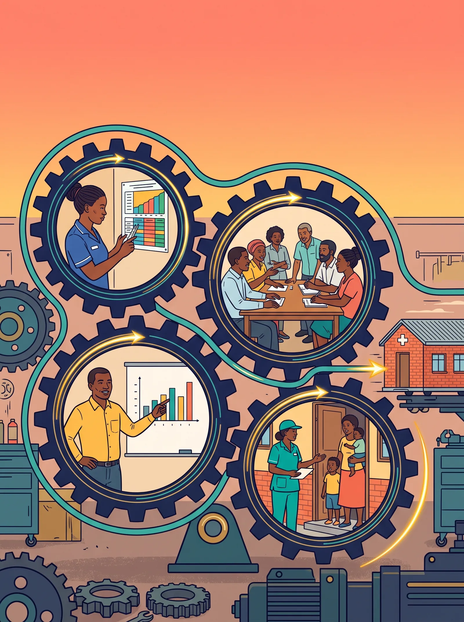
The Data Detective, a five-minute film in a South African voice with captions. Watch it on the films page →
By the time you have read this chapter, you will be able to:
- Trace the information cycle from decision to data collection to discussion and identify at least three points where local action, rather than upward reporting, can improve health services at facility or district level.
- Apply self-assessment questions ("Is this good data?", "But why?", "So what?", "Now what?") to a priority issue, using routine data to diagnose root causes and decide on action using locally available resources.
- Assess the quality of your action indicators using the RAVES model.
- Use problem solving indicators when the action indicators are lagging
- Differentiate between primary (clinical), secondary (management), and "super-use" (storytelling) data use, giving a concrete example of how each level can act on the same data.
- Build a local information team and a simple feedback loop that closes the cycle from data collector to decision maker, ensuring health workers see how their data is used.
Chapter summary
To effectively decentralise health management, local health workers and managers must use routine data to identify and understand local problems and improve services. This requires a culture of routine information use in which facilities and districts move beyond upward reporting and actively use information for local decision-making.
The information cycle provides a practical framework for transforming raw data into action. Routine data are converted into indicators, visualised, interpreted, discussed and used to guide local decisions. As health workers engage with their own data, trust, ownership and data quality improve together.
This chapter explores how districts and facilities can build a practical culture of data use through institutionalised self-assessment, local ownership, simple information systems, teamwork, and action-oriented indicators.
2.1 What is "data use"?
We define data use as: Decision-makers and stakeholders use information in policymaking, planning, and service provision processes, even if final decisions are not solely based on that information.
In a district health system, data use means local stakeholders use routine health data to plan services, monitor performance, identify areas for improvement, allocate resources, support and implement interventions. Above all, information use is about local health managers interacting with their data, understanding its meaning through discussion, and telling stories to give it local context.
Culture of information use
A culture of information use means that data management and decision-making are distributed across local entities that have the knowledge and skills to use information to take effective action to improve health services.
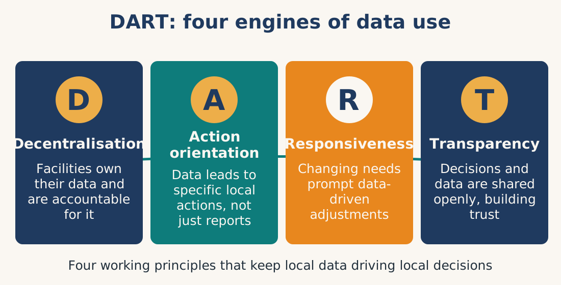
This culture is built on four DART principles:
| Principle | Meaning |
|---|---|
| Decentralisation | Facilities and districts have authority and responsibility, and are accountable for for their own data management processes |
| Action orientation | Data leads to specific local actions, not just reports |
| Responsiveness | Evolving needs and challenges prompt data-driven adjustments |
| Transparency | Open communication of data-driven decisions fosters trust |
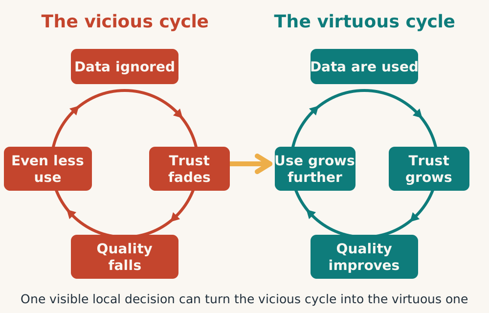
The virtuous data cycle
Data will not be used until it is trusted, and it will not be trusted before it is used. This paradox is resolved through the virtuous cycle:
Use improves trust: When health workers see their data being used locally, they trust it more.
Trust improves quality: When staff trust data, they collect it more carefully.
Quality improves use: Better data leads to better decisions, encouraging further use.
Four engines drive this cycle:
Managers visibly base local decisions on routine data
Managers demand data that is of sufficient quality for local use
Health workers own, take pride in and share their findings through stories
Computer systems are simple and user-friendly
The Story: At Fruit District, no one used the data. No one trusted it. Then the district manager tried something new. At the next staff meeting, she pointed to a graph on the wall. "ANC 4th visit coverage is lowest in the south," she said. "I am moving two midwives there next month." She did it. Staff watched.
A nurse in the south raised her hand. "If you are moving midwives based on our numbers," she said, "then ours need to be right. Let me check the register again." She started keeping her own weekly tally on the wall. "Look," she told her team, "we have improved from 4 to 7 ANC visits per week." She was proud. The data was hers now, not just a report for the district.
The district also made one small change. They replaced a complicated spreadsheet with a simple offline tool. The nurse entered five numbers. One button produced one graph. No training manual. No password reset.
Three months later, the same nurse asked: "Has the graph changed?"
That is the virtuous cycle. It does not start with perfect data. It starts with visible action, local demand, curiosity, pride, and simple tools.
2.2 From data to decision making: The information cycle
Raw data has limited value without context. The information cycle transforms data into action through five stages: These five stages are briefly explained here and dealt with in depth throughout the book
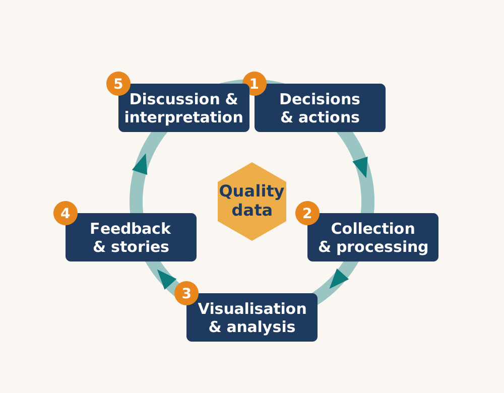
Stage 1: Decide what data you truly need.
Start with your district annual plan that shows the planned activities over the entire year. What decisions are the DHMT actually making this month? This year? What information would make those decisions better? Pick a handful of action indicators, five to ten, (not fifty) to make the focus of your activities. Ask the people who collect data what would actually help them. If you cannot collect it well, do not collect it at all. And remember to review your needs annually. What mattered last year may not matter now.
Stage 2: Collect and process the data.
Gather data from the simplest sources possible, one register, one entry, one time. Check for quality at the source. Look for missing values, impossible numbers, or totals that do not add up. Calculate your indicators immediately using the formula: numerator divided by denominator, multiplied by one hundred.
Do not wait for monthly reports. If a denominator looks wrong, fix it now. Bad data processed is still bad data. And keep it minimal, every extra data element adds work and reduces quality. Collect only what you will actually use.
Stage 3: Visualise and analyse what you found.
Turn your indicators into simple information products. Line graphs show trends over time. Bar charts compare facilities. Maps show distribution. Do not reach for complex dashboards. A hand-drawn chart or map taped to the wall is more powerful than a beautiful screen no one looks at.
Start analysis with one question: "What in this data surprises us?" That surprise is where learning begins and curiosity is awakened. Compare yourself to your own past performance and to your target. Comparing yourself to others comes second. And do this as a team. One person's graph is another person's story. Share the looking.
Stage 4: Close the loop with feedback and stories.
Every single person who collected data must see something come back, a graph, a thank you, a question, an action. Use feedback to show respect. Say to them: "We looked at your numbers. Here is what we learned. Thank you for your work."
Then find one story each month. A surprising drop. An unexpected rise. A facility that solved a problem. Turn that finding into a narrative. Keep it short: beginning (what happened), middle (why it happened), end (what we did or will do). Share stories at meetings, on WhatsApp, or on a sheet of paper posted in the staff room.
Stories spread faster than spreadsheets.
Stage 5: Discuss, interpret and act
Hold a dedicated data meeting each month with protected time, no interruptions, no other agenda. Use the five self-assessment questions: Is this good data? But why? So what? Now what? Add "What is the real story?" when you need it.
Interpreting data means discussing context, not just numbers. What happened last month? A flood? A staff vacancy? A new intervention? End every meeting with specific local actions. Write them down. Name who will do what by when. Then feed those decisions back into Stage 1.
Your actions this month define what data you will need next month ... and the cycle restarts
The Heart of the Cycle: Data Quality
At the centre of every stage sits data quality. Without it, the cycle collapses.
If you decide based on bad data, your actions will fail. If you collect carelessly, you poison everything downstream. If you visualise errors, you spread confusion. If you give feedback from garbage, you break trust. And if you discuss and decide on numbers you cannot trust, you waste everyone's time.
No data is ever perfect. But data is good enough when you understand its limits and still trust it to guide action. Quality does not begin with better software or more training. It begins when health workers see their data being used, because use is the only thing that makes quality matter.
The cycle is not a one-way arrow. It is a circle. It is only complete when action happens, and then it starts again.
2.3 Self-assessment: The core mechanism for local data use
The strategy: (described fully in chapter 8). Self-assessment is a regular, institutionalised process done at district and facility levels where stakeholders look at their (3 to 10) selected action indicators and then take a "deep dive" into one local problem indicator each month.
The team analyses selected action indicators, compares themselves to targets, discusses root causes, and takes local action using the five self-assessment questions below. It must be scheduled monthly, funded, participatory, and action-oriented.
| The Five Self-Assessment Questions | |
|---|---|
| Question | Purpose |
| Is this good data? | Assess whether you can trust the data to make local decisions |
| But why? (ask 3x) | Find underlying root causes, not just symptoms |
| What is the real story? | Understand the local context behind the numbers |
| So what? | Determine what the findings mean for facility, district, community |
| Now what? | Identify local actions you can take with existing resources |
Asking the right questions
The Story: At Guava Health Centre, the team meets every last Thursday of the month at 2 p.m., no interruptions. This month, their measles immunisation coverage is 52%. The nurse asks, "Is this good data?" The clerk checks the denominator. It is wrong, the population figure is from five years ago. She asks "But why?" three times and discovers no one has ever updated it. "Now what?" They decide to do a quick community headcount in two villages next week. No one waits for permission. The time is already on the calendar.
2.4 Indicators: Turning data into information
The numbers in your register are not information. They are raw material.
An indicator transforms raw data into something useful. It is a simple calculation: numerator divided by denominator, multiplied by one hundred.
But that small formula changes everything. It turns fifty cases into a rate. It makes comparison possible. It reveals whether you are improving or falling behind. Without indicators, you are guessing. With them, you are managing.
For managers, indicators offer three essential benefits.
First, they enable comparison, between facilities, between time periods, between your performance and your target.
Second, they reveal problems early, before they become crises.
Third, they guide action by pointing directly to where you need to intervene.
But not every indicator is worth your time. A good indicator must pass the RAVES test: Reliable, Agreed, Valid, Easy, and Sensitive. If it fails any of these, question it. And always question the denominator, it is the weakest link. A wrong denominator means a wrong indicator, no matter how perfect your numerator.
We classify indicators in three ways to promote action.
First, action indicators are your dashboard warning lights. They are a small set of priority indicators linked to your annual plan, monitored monthly, and designed to trigger a phone call. They answer the question: "Are we on track?"
Second, problem-solving indicators are your diagnostic tools. They are activated only when an action indicator lags. Some come from the RHIS. Others emerge from discussion and storytelling. They answer the question: "But why?"
Third, population-based vs. non-population-based indicators tell you different things. Population indicators ask: "Are we reaching everyone who needs us?" Non-population indicators ask: "How well are we serving those who actually come?" You need both. Population indicators reveal equity. Non-population indicators reveal quality and workload. Monitor both. Trust neither completely. Always question the denominator.
The rule is simple: If an indicator does not lead to action, ask why you are collecting it. If it triggers a phone call, keep it.
The story: Two facilities report pneumonia cases. Lychee has 50 cases. Fig has 100 cases. Which is worse? Without an indicator, you cannot tell. Lychee serves 5,000 people, a rate of 1%. Fig serves 20,000 people, a rate of 0.5%. Lychee is actually twice as bad. The denominator changed everything.
The RAVES model for indicator quality
A good indicator must be Reliable, Agreed, Valid, Easy, Sensitive and specific.
Always question the denominator, it is the weakest link.
| Criterion | Question to ask |
|---|---|
| Reliable | Same results when used by different people in different places |
| Appropriate / Agreed | It is necessary to measure this indicator, does it add programme objectives Discussed and approved by all stakeholders? |
| Valid | Truly measures what it claims to measure? |
| Easy | Can it be simply calculated using routinely available data? |
| Sensitive / Specific | Do changes immediately reflect changes in the actual situation? Measures what it is supposed to measure |
The story: Fruit District used "pneumonia treatment rate" as an action indicator. At Lychee, it drops from 88% to 55% in one month. The manager is alarmed. But the indicator is not Valid, it measures only facility-treated cases, not children referred to hospital. Lychee had simply started referring severe cases appropriately. The indicator dropped because care improved, not worsened. The denominator was never the problem. The indicator itself was.
2.4.1 Action indicators
We have chosen to use the term ACTION indicators in place of Key Performance Indicators to emphasise action, the desired outcome of the calculation.
Action indicators are a small set of priority indicators linked to annual plans, intended to trigger action. Each level has its own set of action indicators and they are monitored regularly (monthly or quarterly), discussed locally, and used for planning, supervision, feedback, and quality improvement.
Examples include ORS use for diarrhoea, tuberculosis treatment completion, and ANC 4th visit rate.
Note: The biggest problem with indicators is usually the population denominator, which at facility level is notoriously unreliable. Always question the denominator before trusting the indicator.
The story: The district annual plan has sixty indicators. No one can look at all of them. The MCH manager monitors just five action indicators every month. When ANC 4th visit drops below 60%, she does not file a report. She calls the facility. She asks "But why?" If there is a continuous problem, she sends a mentor. That is the difference between an indicator and an action indicator, the second one triggers a phone call.
2.4.2 Problem solving indicators
Problem-solving indicators are a secondary layer of diagnostic metrics, drawn directly from routine data systems. They are not monitored routinely by default; instead, they exist as a reserve toolkit. They are only pulled out and analysed only when an action indicator flashes red. Their entire purpose is to answer the question "But why?", providing the granular background and contextual layers needed to turn a vague warning signal into a targeted, evidence-based hypothesis that can lead to action
Examples (see Example 1) include the proportion of women registering for ANC in the first trimester (to contextualise late drop-offs), the stock-out rate of essential maternal health commodities, lab turnaround times for syphilis or HIV tests, and the cadence of missed appointment follow-up calls. For TB, PSIs might be defaulter tracing rate or the proportion of directly observed therapy (DOT) sessions actually observed versus documented.
Note: The biggest trap with problem-solving indicators is over-analysis. Because the data is already collected, there is a temptation to run the numbers every month "just in case." This is a mistake. It drowns staff in spreadsheets and dilutes focus. The golden rule of PSIs is strict conditional analysis, they are only tabulated when the action indicator triggers the threshold. Their value lies in their targeted, timely use, not their routine frequency.
The story: The Fruit District annual plan has one hundred and sixty indicators, but the MCH manager ignores one hundred and fifty-five of them until she has a problem. Her action indicator, ANC 4th visit coverage, drops to 55%. She does not write a report. She calls the facility. "But why?" she asks. They don't know. So, she opens her pre-existing routine HMIS data and runs her pre-selected problem-solving indicators. She doesn't look at all indicators; she pulls just four. She finds that first-trimester registrations are actually up (so access isn't the issue), but lab turnaround times for routine syphilis tests have ballooned from 2 days to 3 weeks. Women never came back for their 4th visit because they never got their 2nd-visit blood results. Now she has context. She doesn't send a generic mentor to lecture on antenatal care; she sends a lab supply chain officer to fix the reagent stock-out. That is the difference between an action indicator and a problem-solving indicator, the first one tells you what is failing and triggers the call; the second one tells you why it's failing and tells you exactly who to send to fix it.
But Why? Problem solving indicators
2.4.3 Population-based vs. non-population-based indicators
Every action indicator in your monthly report answers a question.
The question determines whether you need a population denominator or not.
Population-based indicators ask: "Are we reaching everyone who needs us?" They use the total population at risk as the denominator, all pregnant women, all children under one, all people living in your catchment. Their advantage is equity: they use epidemiological thinking to reveal who is being left behind. If coverage is low, you know outreach is failing.
Their disadvantage: denominators are often wrong. Population estimates at facility level are notoriously unreliable, which means your coverage figure might be wrong even when your service data is perfect.
Non-population-based indicators ask: "How well are we delivering care to those who actually come?" They use service data as the denominator, ANC 1st visit, children seen, patients enrolled. Their advantage is accuracy: you know the numbers are real because they come from your registers. They reflect workload, quality, and system performance.
Their disadvantage: they hide inequity. If only half the community comes to your facility, your non-population indicators might look excellent while the other half receives no care at all.
The solution: Use both. Population indicators tell you if you are reaching everyone. Non-population indicators tell you how well you are serving those who arrive. Together, they give you the complete picture, coverage and quality, access and retention, equity and efficiency. Monitor both. Trust neither completely. Always question the denominator.
The table below shows a district's full indicator set. Use it as a reference (full numerators and denominators are in Example 1), but remember the distinction. Every indicator is either telling you about coverage (population) or about quality and workload (non-population). You need both to manage effectively.
| Population based (coverage) | ||
|---|---|---|
| ANC 1st visit coverage | ANC 4th visit coverage | Skilled birth attendance rate |
| Measles containing vaccine 1st dose coverage rate | DPT containing vaccine 3rd dose coverage rate | DPT containing vaccine 1st dose coverage rate |
| NON Population based (Quality/ workload) | |||
|---|---|---|---|
| Reporting Timelines rate | Child measured for height and weight rate | Fever tested for malaria (0 to 4 years) (RDT+Microscopy) rate | ANC 1st visit tested for HIV rate |
| Child measured for height and weight rate | Malaria positive (RDT+Microscopy) treated (0 to 4 years) with ACT rate | Malaria tested positive (0 to 4 years) (RDT+Microscopy) rate | ANC 1st visit tested HIV positive rate |
| Pneumonia (0 to 4 years) treated with antibiotics rate | Diarrhoea (0 to 4 years) treated with ORS/Zinc rate | Malnutrition severe admission rate | ANC 4th visit drop out rate |
| Postnatal care within 48 hrs rate | Dropout rate (DPT1, DPT3) | DS-TB new smear positive success rate | ANC 4th visit rate |
| Teenage pregnancy rate | Breastfeed within 1 hour of birth rate | Stockout days (by specific drug) | ART retention at 12 months rate |
2.5 Levels of data use
Data serves different purposes at different levels of the health system. The same malaria test result means something different depending on who is looking at it.
At the facility level: Primary use: Clinical care.
The facility is the only level that uses data for individual client care and management. This is the core function. Facility staff collect, record, and enter data, then use it to:
Treat individual patients
Monitor patient care and track health outcomes
Identify service gaps
Guide clinical decision making at follow up
The story: A nurse sees a diarrhoea case and treats the sick child. She monitors whether the child recovers. She notices more cases than usual and spots a service gap. From her register, she calculates an indicator, draws a simple graph on paper, and during monthly self-assessment, the team realises they need to give better feedback to community health workers. The facility collects the data and uses it first.
At facility level and above: Secondary use: System management.
Managers at facilities as well as district, provincial, and national levels use data to strengthen health system building blocks (governance, human resources, service delivery, medicines, finances, information systems).
This local system management (stewardship) puts the policies and plans (governance) into practice. Simple institutional routines and activities enable the health system to function as an integrated whole, each part of it monitored by the Routine Health Information System.
| Management Function | How data is used |
|---|---|
| Planning | Identify local health needs, allocate resources equitably, evaluate programme impact |
| Monitoring | Track annual plan progress against targets, identify underperforming areas |
| Supervision | Identify facilities needing support, provide remote or onsite feedback |
| Resource allocation | Direct money, staff, and supplies to areas of greatest need |
The story: The district manager never treats a patient. But they use facility data to strengthen entire systems, governance, human resources, medicines, finances. Plans are made by identifying local health needs and allocating resources fairly. Progress is monitored against the annual plan, spotting underperforming facilities. Remote or on site supervision is done, giving feedback based on evidence. And then directs money, staff, and supplies where they are needed most.
Higher levels do not produce data. They use data from facilities to make the whole system work better.
At every level: Storytelling.
Storytelling (See chapter 7) means explaining data in its local context so that health workers and communities understand why patterns occur and what action should follow.
The storytelling process:
Identify a surprising or important finding from your data
Ask "But why?" to understand root causes
Build a narrative with beginning, middle, and end
Include local context (weather, events, staffing changes)
Share with stakeholders and ask: "What should we do?"
The story: A health worker at any level can do this. She finds a surprising finding in her data. She asks "But why?" until she understands root causes. She builds a narrative with a beginning, middle, and end, adding local context like weather or staffing changes. Then she shares it with stakeholders and asks: "What should we do?"
For example: "Our malaria suspect rate dropped from 28% to 12% during the rainy season, but not because malaria decreased. We trained CHWs to test in villages. Only severe cases reach the facility now. The real story: community-based testing works."
Three levels. Three different uses. One data point.
2.6 Five ways to increase data use (and quality)
These five strategies are intertwined and work together to create a culture of information use. Each one is stated simply, then shown in action.
2.6.1 Decentralise demand for information
The strategy: Local teams use standard indicators for self-assessment, monitoring, feedback, discussions, storytelling, supervision, and annual planning. Demand for information should come from the bottom up, not just the top down.
The story: At Lychee Dispensary, the nurse calculates the malaria positivity rate every month not because the district asked for it, but because the team wants to know if their new village testing programme is working. They track the trend against their own target. At Monday's meeting, a community health worker says, "The data shows we tested 40 children last week, but three mothers refused the test. Why?" The team discusses possible reasons. They decide to add a community elder to their next village outreach. The district never requested this analysis. The facility demanded it for themselves.
2.6.2 Institutionalise self-assessment
The strategy: (See chapter 9) Make self-assessment a regular, funded activity with dedicated staff time. Use five questions, "Is this good data? But why? What's the story? So what? Now what?", to drive root cause analysis and local action.
The story: Every last Thursday of the month, the Guava Health Centre locks the door at 2 p.m. A sign says "Data meeting, no interruptions." The information team has two hours of protected time, and the district has budgeted a small lunch. They pull up their immunisation coverage, 52%, far below target. They ask "Is this good data?" The denominator looks wrong. They ask "But why?" three times and discover that the population figure is from the last census, five years ago. They ask "Now what?" and decide to do a quick community headcount in two villages next week. No one waits for permission. The time and funding are already in place.
2.6.3 Enhance ownership
The strategy: (see chapter 8) Staff own their data when they discuss it, tell stories about it, and use it to understand their local context. Build ownership through involving programme managers, strengthening information teams, developing facility profiles, encouraging storytelling, and active stakeholder engagement.
The story: Grace, the MCH programme manager, used to ignore monthly reports. Then her manager made her present her own data at the quarterly review. The first time, she read numbers from a paper. Someone asked, "Why is ANC 4th visit coverage rate down?" She did not know.
The second time, she prepared. She called the three worst-performing facilities. One had a staff vacancy. One had a flooded road. One said, "I did not think anyone looked at this."
At the review, Grace pointed to a map. "Three facilities. Three problems. Here is how we fix each one." Her manager smiled. Grace had stopped receiving data. She had started owning it. Soon she was requesting her dashboard every Monday, calling low performers before reports were due, and telling stories at every meeting.
The data was no longer the clerk's job. It was Grace's.
2.6.4 Simplify computer systems
The strategy: Keep Information Systems Short and Simple (KISS). Develop user-friendly data collection tools, automated quality checks, standardised visual reports, one place for all action indicator data, and basic technology infrastructure.
The story: Lemon Health Centre has no internet and one old computer. The district did not buy new software. Instead, they installed a simple offline DHIS2 data entry tool that works on the existing machine. The nurse enters five numbers each day. The system automatically checks for obvious errors, "You entered 150% coverage, please check." At the end of the month, one click produces three coverage graphs: immunisation, ANC, and malaria treatment .
The nurse prints them and tapes them to the wall. No complex dashboard. No cloud. No training manual. Just simple, working tools.
2.6.5 Empower staff through teamwork
The strategy: Every facility (bigger than a dispensary) needs an information team led by a local information champion, including clinicians, information officers, and managers, with protected time and a mandate to complete the full information cycle. The information officer/ data clerk handles computer work and visuals. Managers present and discuss the data.
The story: At Guava Health Centre, the information champion is Mr. Guava, an environmental health officer who loves numbers. His team includes the head nurse and the data clerk.
They meet for an information huddle every Tuesday for one hour, protected time written into their schedules. The clerk produces the graphs and they ask the self-assessment questions.
The head nurse then presents the findings at the weekly staff meeting. Mr. Guava leads the discussion. When the untreated malaria positive cases spiked from 4 to 18 cases in one week, the team did not wait. They traced the problem to a single village where the CHW had run out of antimalarials. Within 48 hours, the clerk had flagged the issue, the nurse had presented it,Mr. Guava had arranged a resupply. The manager never touched the computer. But she made the decision.
The manager presented the story at the quarterly district data review and was widely praised for the intervention. Other facilities took note and antimalarial ordering improved throughout the district
These five strategies are not separate. They reinforce each other. A facility that decentralises demand also needs self-assessment. Ownership requires teamwork. Simple computers make all of it easier. Together, they turn data from a burden into a tool.
2.7 Summary for the manager: Local actions to take tomorrow
| Role | Action |
|---|---|
| Health Centre Manager | Post one graph on the wall showing a trend. Ask your team: "What does this mean for us?" |
| District Manager | Visit one facility. Sit with the local team. Discuss their register, graphs, and stories. Ask: "What surprised you in your data this month?" |
| Policy Maker | Reduce required data elements by 10%. Support facilities to choose 10 indicators to monitor monthly. |
References
- Aqil, 2009
- World Health Organization, 2023
- Seid, 2021
- Kawakyu, 2022
- Tanzania health system study, 2026
- Dodoma region study, 2024
- Gofa zone study, 2025
- Avan, 2016
- Burkina Faso nutrition data study, 2025
- World Health Organization, n.d.
Annex 1: Indicators, action and problem solving
Possible Action Indicators and PSIs along with indicators and required data items
Action indicators all checked monthly at Self Assessment
Problem solving indicators: linked to Action indicators but only needed if they are lagging, used for deep dive.
Some are formal RHIS indicators.
Others are more subjective and come from interpreting indicators, telling stories
| Action indicator | Definition (numerator / denominator) | Problem solving indicators (only for deep dive when problems) |
|---|---|---|
| 1. Client attendance rate | Client visit / Population total | Transport interruption: floods, bus service Service complaints: excess waiting time, staff rude, other attitudes |
| 2. Child 0 to 4 years attendance rate | Child 0 to 4 years seen / Population 0 to 4 years | Outreach activities to communities Neighbouring clinics preferred CHW turnover rate |
| 3. Measles 1st dose (0 to 11 months) coverage | Measles 1st dose (0 to 11 months) / Population 0 to 11 months | Fully immunised by 12 months of age rate Coverage of other vaccines Vaccine stockouts Cold chain failure rate Vaccine preventable disease rate Outreach schedule completion rate Adverse event following immunisation rate |
| 4. Child measured for weight and height (0 to 59 months) rate | Child measured for weight and height (0 to 59 months) / Total children (0 to 59 months) seen | Malnutrition (severe/moderate) OTP start rate Not gaining weight rate Outreach schedule completion rate No growth cards or broken scale |
| 5. Child diarrhoea rate | Child with diarrhoea (0 to 4 years) / Child seen (0 to 4 years) | ORS treatment rate (0 to 4 years) Other communicable disease rates Water sources checked |
| 6. ANC 1st visit coverage | ANC 1st visit / Expected pregnancies | Contraceptive use rate (high and increasing) Alternative ANC from other health facilities, including private ANC 1 to 4 drop out rate |
| 7. Skilled birth attendance rate | Skilled birth attendance (at delivery) / Population expected live births | Staffing level Access to delivery unit/facility Use of traditional birth attendant |
| 8. Postpartum care within 48 hours of delivery rate | Postpartum care (within 48 hours of delivery) / Delivery in facility | Facility accessibility Staffing level |
| 9. DS-TB new smear positive success rate | DS-TB new smear positive cured or completed / DS-TB new smear positive treatment start cohort | Suspect cases with sputum exam Side effects rate DOTS a problem due to distance TB medicine stockout MDR and XDR cases rate |
| 10. HIV retention on ART rate | HIV retention on ART at 12/36/48/72 months / HIV retention on ART start | HIV viral load testing rate HIV medicine stockout Contact tracing rate Condom distribution rate PrEP meds dispensed / HIV cases registered |
| 11. Hypertension (HPT) treated rate | Hypertension client received medication / HPT clients on register | Medicine availability Referred HPT cases for high BP HBP with BP controlled |
| 12. Chronic conditions, other rate | Local conditions: asthma in children, cancers for follow up, severe skin conditions, etc. | Service accessibility Treatment availability Drop out / retention rates |
| 13. Infectious diseases of public health importance reported | Notifiable ID cases investigated / all IDs of concern notified | Laboratory data Pharmacy data |
| 14. Medical / nursing staff workload | Clinic attendance total / medical and nursing staff days worked | Absenteeism rate Medical staff positions unfilled Temporary staff assigned from other facilities Staff to population ratio |
| 15. Drug stockouts | Clinic days without key indicator drugs (specific drugs each facility) | Number of essential drugs monitored Days since last order requested Drug over-stocks and expired, list Refrigerator malfunctioning |
| 16. Reporting timeliness | Reports submitted by deadline / Reports expected | Report forms missing Computer breakdown Registers missing or fully used Clerk on leave or not present |